
All in One View
Content from Acquiring Vector Datasets from Data Repositories
Last updated on 2026-06-24 | Edit this page
Overview
Questions
- What kinds of vector data already exist online and where can I find them?
- How do I evaluate whether a dataset is accurate, current, and appropriate for my needs?
- How do I download and bring external vector data into QGIS?
Objectives
- Distinguish between collecting original data and using pre-existing data from repositories
- Identify appropriate data sources for different geographic and thematic needs
- Evaluate a dataset’s quality, accuracy, and fitness for purpose by examining its metadata
- Download vector datasets from public repositories and load them into QGIS
- Pre-existing vector datasets are available from government portals, academic repositories, and open-source platforms — you rarely need to create data from scratch.
- Always examine a dataset’s metadata before using it: understand when it was created, how it was collected, and what its limitations are.
- Open-access datasets vary widely in quality and completeness; exploring the data carefully is as important as finding it.
- OpenStreetMap provides a rich, continuously updated global dataset accessible both as downloads and through QGIS plugins like QuickOSM.
- Bookmark sources relevant to your research area — a curated list of trusted repositories saves significant time at the start of future projects.
Introduction: Original Data vs. Pre-Existing Data
An important decision at the start of any geospatial project — whether you are making a basic reference map or conducting advanced spatial analysis — is whether you need to collect original data or whether suitable data already exists.
Original data collection is appropriate when: - No existing dataset covers the geographic area or time period you need - The precision or accuracy requirements of your project exceed what publicly available data provides - You are documenting something that has not been mapped before
Pre-existing data is appropriate when: - The feature type you need (political boundaries, road networks, river systems, populated places, etc.) has already been digitized and made available by a government agency, research institution, or open-source community - Time or resources do not permit original data collection - You need a large geographic extent — for example, country-level or global coverage
For most common geographic features, pre-existing data exists somewhere on the web and does not need to be recreated. Knowing where to find it, and how to evaluate its quality, is one of the most practical skills a GIS practitioner can develop.
Evaluating Data Quality
Before using any dataset in your project, take time to examine it critically. Open-access datasets vary widely in quality, precision, currency, and the amount of preprocessing required before they are useful. Key questions to ask:
- When was it created or last updated? A road network dataset from 2005 may be unreliable for current analysis.
- How was it collected? Was it digitized from satellite imagery? Surveyed in the field? Derived from crowd-sourced contributions? Each method carries different accuracy expectations.
- What is the spatial resolution or scale? A dataset designed for 1:1,000,000 global mapping will look imprecise if zoomed to the neighborhood level.
- What do the attribute fields represent? Read the metadata and data dictionary — field names are often cryptic codes that need interpretation.
- Are there known gaps or limitations? Most reputable data providers document these in their metadata pages.
As a rule: explore the data before you use it. Load it into QGIS, open the attribute table, check the geographic coverage, and compare it against a basemap or another source before building analysis or a finished map on top of it.
Data Source Directory
The following sections organize free, publicly accessible vector data
sources by category. Sources specific to your local area (city, county,
or state open data portals) are not listed here but are worth
bookmarking — search for
[your city or state] open data GIS.
For our next part of this session, check out the shared google doc here.
Go to Day 1 Session 1a: Vector Data/QGIS to find resources
that we will be using in our upcoming modules!
This list is provided as a reference only; we do not guarantee the accuracy or timeliness of any individual dataset.
Data Consortiums and Hubs
These platforms aggregate datasets from multiple providers and are a good starting point when you are not sure which specific source to use.
| Source | Description |
|---|---|
| Esri Open Data Hub | A large, searchable collection of open datasets contributed by government agencies and organizations worldwide. Datasets are downloadable in shapefile, GeoJSON, and other formats. |
| NYU Spatial Data Repository | A curated academic geospatial repository maintained by New York University Libraries. Strong coverage of urban and international datasets. |
| GeoPortal at Tufts | Tufts University’s geospatial data repository, with strong coverage of historical and international data. |
| Big Ten Academic Alliance Geoportal | A collaborative geoportal maintained by Big Ten universities, aggregating geospatial data from government and academic sources across North America. |
| Demographic and Health Surveys (DHS) Spatial Repository | Spatial data tied to DHS survey results, covering health indicators across low- and middle-income countries. |
OpenStreetMap
OpenStreetMap (OSM) is a collaborative, open-license global map built by volunteers. It is one of the richest freely available sources of detailed, up-to-date geographic data, particularly for urban features.
| Source | Description |
|---|---|
| openstreetmap.org | The main OSM website. You can browse the map, contribute edits, and learn about the project. |
| Geofabrik Downloads | Pre-packaged OSM data downloads organized by country and region, available in Shapefile and other common GIS formats. Best for downloading a whole country or region. |
| OSM Map Features Wiki | The reference guide to OSM’s tagging system — explains how features like roads, buildings, land use, and amenities are classified and coded. Essential reading before running QuickOSM queries. |
| Humanitarian OpenStreetMap Team (HOT) | A nonprofit that activates OSM mapping in response to humanitarian crises. Provides curated datasets for disaster-affected areas. |
Government Data Sources
Most government data portals provide data specific to their jurisdiction. The sources below cover a range of U.S. scales — city, county, federal — as well as a few of the most useful thematic federal datasets.
City and regional portals (most major cities have something comparable):
| Source | Description |
|---|---|
| Open Indy Data Portal | Indianapolis’s open data platform, typical of what major U.S. cities provide. |
| City of Chicago Open Data Portal | One of the most comprehensive U.S. city open data portals, with hundreds of datasets on crime, health, transit, zoning, and more. |
| City of Boston Open Data Portal | Boston’s geospatial open data, including parcels, neighborhoods, and public infrastructure. |
| NYC Planning Department Datasets | New York City Department of City Planning data including zoning, land use, and administrative boundaries. |
Federal U.S. sources:
| Source | Description |
|---|---|
| US Census Bureau Data and Maps | The primary source for demographic, economic, and boundary data for the United States. Includes TIGER/Line shapefiles for census geographies at all levels. |
| National Historical GIS (NHGIS) | Historical U.S. census data and boundary files from 1790 to the present, maintained by the University of Minnesota. Invaluable for temporal analysis. |
| US HUD Geospatial Data Storefront | Housing and Urban Development spatial data including fair market rents, opportunity zones, and public housing locations. |
| US CMS Provider Data Portal | Healthcare provider locations and quality metrics from the Centers for Medicare and Medicaid Services. |
| US County Health Rankings and Roadmaps | Annual county-level health outcome and health factor rankings for all U.S. counties. Tabular data linkable to Census boundary files. |
| USDA Economic Research Service, County-Level Data | Agricultural, economic, and food environment indicators at the U.S. county level. |
Global Peace, Health, and Economic Well-Being
These sources provide indicators relevant to global comparative research and humanitarian applications.
| Source | Description |
|---|---|
| DHS Program Spatial Data Repository | Geospatial data linked to Demographic and Health Survey results across low- and middle-income countries. |
| University of Gothenburg Quality of Government (QoG) Portal | Cross-national governance, corruption, and institutional quality indicators compiled from dozens of sources. |
| Vision of Humanity — Global Peace Index | Annual country-level peace and conflict indicators with interactive and downloadable maps. |
| Uppsala Conflict Data Program (UCDP) | Maintained by Uppsala University; one of the most comprehensive databases of organized violence and armed conflict globally. |
| WHO Global Health Observatory | World Health Organization data on disease burden, health system capacity, and mortality globally. |
| World Bank World Development Indicators | Comprehensive development data covering 200+ countries across economics, education, health, and environment. |
| Maddison Project Database (University of Groningen) | Long-run historical GDP and population estimates for countries worldwide, going back centuries. |
| Freedom House — Freedom in the World | Annual assessments of political rights and civil liberties for countries and territories. |
Physical and Environmental Features
| Source | Description |
|---|---|
| Natural Earth | A public domain dataset of natural and cultural features at 1:10m, 1:50m, and 1:110m scales. Ideal for world and continental maps. Covers coastlines, rivers, lakes, country boundaries, populated places, and much more. |
| HydroSHEDS | High-resolution hydrological data derived from NASA SRTM elevation data, including river networks, watersheds, and drainage basins. |
Evaluating Data Sources
- You found two datasets covering the same topic from different providers. They do not agree — features that appear in one are missing from the other, or the boundaries differ. How do you decide which to trust?
- When would you choose to download a full country dataset from Geofabrik rather than running a QuickOSM query? What are the trade-offs?
- Think about the research or mapping work you want to do. Which two or three sources from the directory above are most relevant to your area of interest, and why?
Content from Exercise 1a: Acquiring Data and Making Your First Map in QGIS
Last updated on 2026-06-28 | Edit this page
Overview
Questions
- How do I load spatial data into QGIS?
- How can I add different types of vector data — shapefiles, CSV files, and live OSM data — to a map?
- How do I style and symbolize data to communicate clearly?
- How do I build and export a finished, publication-ready map layout?
Objectives
- Load and explore spatial datasets from multiple sources
- Install and use QGIS plugins to extend functionality
- Style layers using Single Symbol, Categorized, and Graduated options
- Build a map layout with all essential map elements
- Export a publication-ready map as an image or PDF
- QGIS can load vector data from shapefiles, GeoJSON files, geocoded CSV files, and live OpenStreetMap queries.
- Layer order matters — drag layers so that points and polygons of interest sit above basemap layers.
- Styling choices (symbol, color, size) should serve the map’s purpose, not just look decorative.
- A complete map layout includes a title, legend, scale bar, north arrow, and data source credit.
- Save your project frequently using
.qgz— losing work to an unsaved session is the most common beginner mistake.
Introduction
QGIS is a free, open-source Geographic Information System that runs on Windows, macOS, and Linux. In this episode we will go from a blank project to a finished, exported map using real spatial data.
The walkthrough below covers the core workflow — loading a shapefile, styling it, and building a map layout. The exercises that follow introduce additional data types (CSV files and live OpenStreetMap data) and give you practice combining multiple layers into a single map.
Part 1: Loading Data
Step 0: Create a Project Folder
Before opening QGIS, create a folder on your desktop called
Session_1a. All data files you download will go here,
and your QGIS project file (.qgz) will be saved here too.
Keeping data and project files together prevents broken layer links
later.
Step 1: Add a Basemap
- In the Browser Panel, click on XYZ Tiles.
- You will see two options: Global Terrain and OpenStreetMap.
- Right-click OpenStreetMap and select Add Layer to Project.
- A world map should now appear in the Map Panel.
Step 2: Download and Add a Shapefile
We will use the QGIS sample dataset for this walkthrough. Download
the airport data from the QGIS
Sample Data repository — specifically, airports.shp
from the shapefiles folder.
A shapefile is not a single file. You must download all of the
following supporting files alongside the .shp or the layer
will not load correctly:
| File | Purpose |
|---|---|
airports.shp |
Geometry (the point locations) |
airports.dbf |
Attribute table (the data) |
airports.prj |
Coordinate reference system |
airports.shx |
Spatial index |
airports.cpg |
Character encoding |
Save all files to your Session_1a folder.
To add the shapefile to your map:
- Go to Layer → Add Layer → Add Vector Layer.
- Under Source, click the … button
and navigate to
airports.shp. - Click Add, then close the dialog.
- In the Layers Panel, drag the
airportslayer above the OpenStreetMap layer so the airport points appear on top of the basemap.
Layer Order Matters
QGIS draws layers from bottom to top. If your data layer is underneath the basemap in the Layers Panel, it will be hidden. Always check that your data sits above any basemap layers.
Step 3: Explore the Attribute Table
The attribute table contains the data values behind every feature on the map. To open it:
- Right-click the
airportslayer in the Layers Panel. - Select Open Attribute Table.
- You should see 76 rows — one for each airport in Alaska.
Explore the columns: you will see fields for airport name, elevation, and other attributes that can be used to style the map in the next section.
Save Often
Go to Project → Save (or Ctrl+S / Cmd+S) regularly. QGIS does not autosave. Losing progress to an unsaved session is the single most common beginner mistake.
Part 2: Styling Your Map
Step 1: Open Layer Properties
Right-click the airports layer →
Properties → navigate to the Symbology
tab.
Step 2: Choose a Symbol Style
QGIS offers three main styling modes:
| Style | Use when… | Example |
|---|---|---|
| Single Symbol | All features should look the same | All airports shown as identical blue dots |
| Categorized | Features belong to named groups | Airports colored by type (international, regional, private) |
| Graduated | Features vary along a numeric scale | Airport symbols sized by elevation |
For the airports layer, try Single Symbol first to get comfortable with the controls. You can adjust the marker shape, size, color, and transparency from this panel.
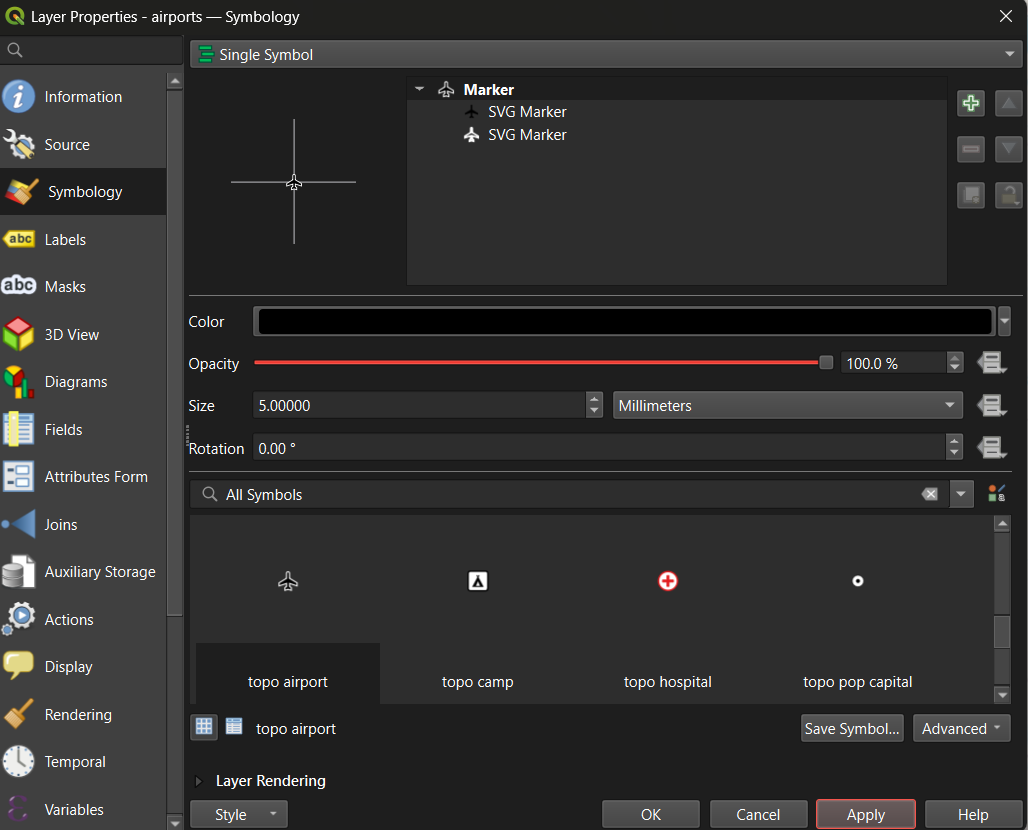
Tip: Set the Magnifier at the bottom of the Map Panel to 75% if the map feels too large for your screen.
Tip: To rename a layer (which also controls how it appears in the legend), right-click the layer → Properties → Source → Layer Name. Give it a clear, human-readable name before building your layout.
Step 3: Apply a Graduated Style (Optional — for numeric data)
Graduated symbology is useful when your data has a meaningful numeric
field. The QGIS sample data includes an elevation CSV
(elevp) in the csv folder of the same
repository. Download it and try:
- Load the CSV as a delimited text layer (the full method is covered in Exercise 1a.2 below).
- Open its Symbology → select Graduated.
- Choose the elevation field as the value column.
- Select a sequential color ramp (light to dark).
- Adjust the number of classes and click Apply.
This is the same graduated approach you would use for a choropleth map of Census data or any other continuous numeric variable.
Part 3: Creating a Map Layout
The Print Layout is QGIS’s dedicated tool for building finished, export-ready maps. It is separate from the main map canvas — the main canvas is for exploration, the Print Layout is for publication.
Step 1: Open a New Layout
- Go to Project → New Print Layout (or click the New Print Layout icon in the toolbar).
- Give the layout a name and click OK.
- A new window will open with a blank white canvas representing your page.
Step 2: Add the Map Frame
- In the toolbar on the left side of the Layout window, click Add Item → Add Map.
- Draw a rectangle on the canvas by clicking and dragging. The current map view from your main canvas will appear inside the rectangle.
- Use the Item Properties panel on the right to lock the scale or adjust the extent if needed.
Step 3: Add All Required Map Elements
A complete, publication-ready map must include the following elements. Use the Add Item menu in the toolbar to insert each one:
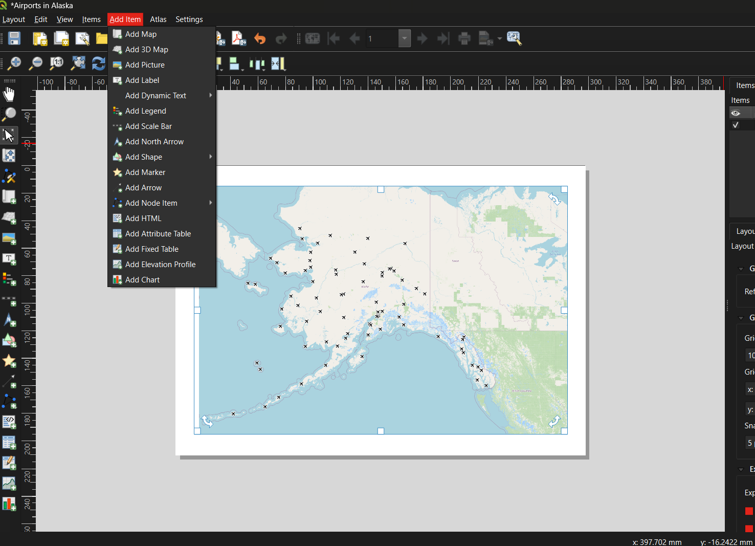
| Element | How to add | Notes |
|---|---|---|
| Title | Add Item → Add Label | Draw a text box at the top of the canvas; enter a descriptive title |
| Legend | Add Item → Add Legend | QGIS auto-populates from layer names — this is why renaming layers matters |
| Scale Bar | Add Item → Add Scale Bar | Choose units appropriate for your map extent |
| North Arrow | Add Item → Add North Arrow | Only strictly necessary if north is not obviously up |
| Data credit / metadata | Add Item → Add Label | Add at the bottom: your name, data sources, and date |
Step 4: Export the Layout
Once you are satisfied with the layout:
- Go to Layout → Export as Image (for PNG/JPEG) or Layout → Export as PDF.
- Accept the default settings and click OK.
- Return to the main QGIS window and save your project:
Project → Save (
.qgz).
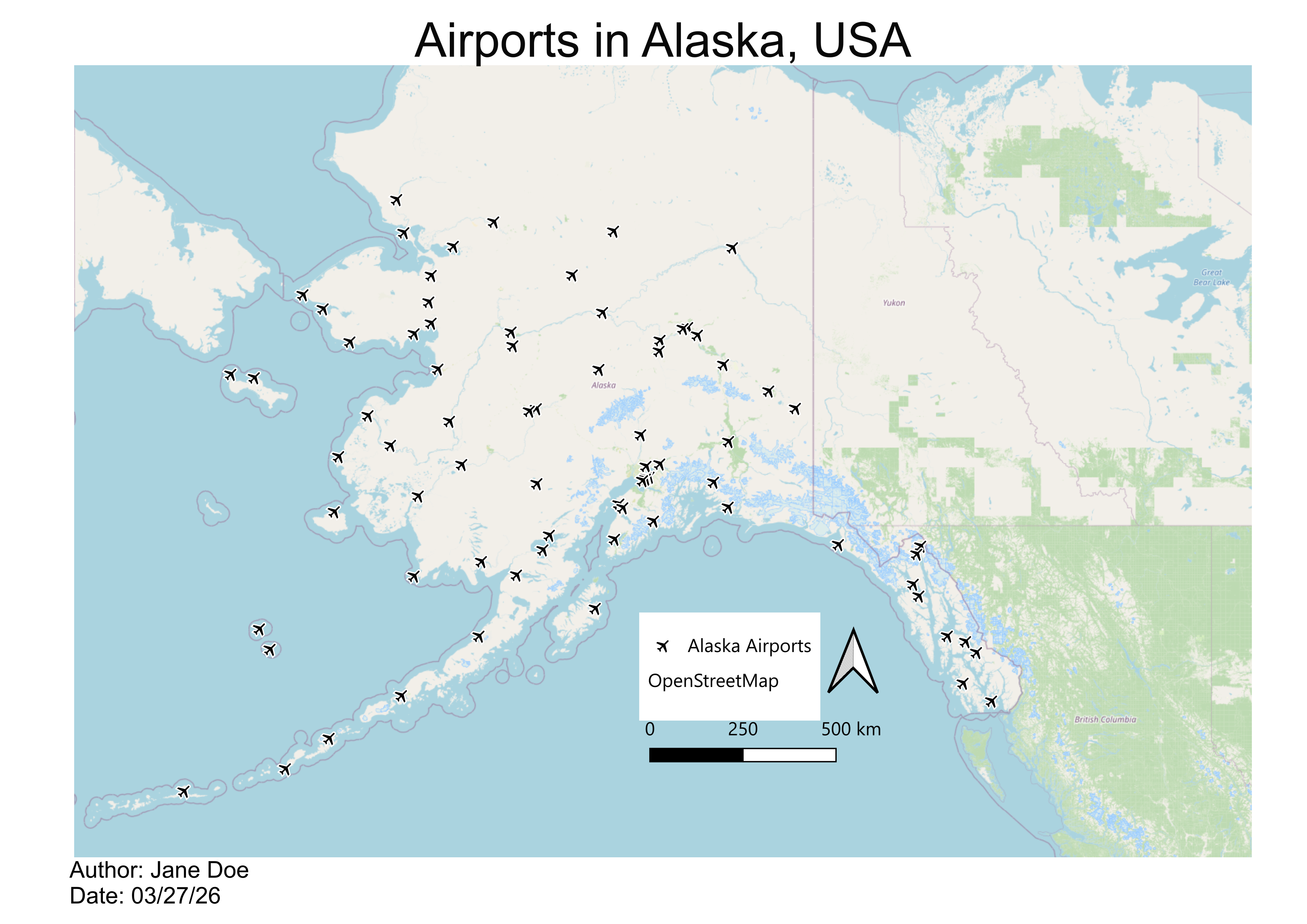
Below is an example of a finished map created using this workflow — Alaska airports displayed as point symbols over an OpenStreetMap basemap:
Common Beginner Mistakes
| Mistake | How to avoid it |
|---|---|
| Forgetting to save the project | Use Ctrl+S / Cmd+S frequently; save before every major step |
| Data layer hidden beneath the basemap | Check layer order in the Layers Panel; drag data layers above basemaps |
| Shapefile won’t load | Ensure all five supporting files (.dbf,
.prj, .shx, .cpg) are in the same
folder as the .shp
|
| Legend shows code names instead of readable labels | Rename layers before building the layout via Properties → Source → Layer Name |
| Map exports blank | Make sure the layout’s map frame is linked to the correct map canvas |
| Overcomplicating symbology | Start with Single Symbol; add complexity only when it communicates something specific |
Exercise 1a.1: Guided Walkthrough
Load, Style, and Export Your First Map
Complete Parts 1–3 above using the QGIS sample airport dataset. By the end you should have:
- A QGIS project with an OpenStreetMap basemap and the airports shapefile loaded
- The airports layer styled with a symbol of your choice
- A Print Layout exported as a PDF or PNG that includes a title, legend, scale bar, north arrow, and data credit
Exercise 1a.2: Build a Multi-Layer Map of West Lafayette
Challenge
Real-world GIS projects rarely use a single data source. In this exercise you will combine three different data-loading methods — shapefiles, a geocoded CSV, and a live OpenStreetMap query — to build a multi-layer map.
Setup: Create a new QGIS project saved to your Session_1a folder.
Step 1 — Download shapefiles from Natural Earth
Go to naturalearthdata.com and read the homepage briefly to understand the data’s purpose, scale, and reliability. Then navigate to Downloads → Medium Scale Data and download the following:
From Cultural:
- Admin-0 Country boundaries (polygon)
- Admin-1 States and Provinces (polygon)
- Populated Places (point)
From Physical:
- Rivers, Lake Centerlines (line)
Save all files to your Session_1a folder and add them to your QGIS
project using Layer → Add Layer → Add Vector Layer (or
drag the .shp files directly onto the Layers Panel).
Step 2 — Add point data from a CSV file
Download UFOreports_USonly_WorkshopLayer.csv from the
shared Session
1a Google folder and save it to your Session_1a folder. Then:
- Click the Open Data Source Manager button in the toolbar (or Layer → Data Source Manager).
- Select Delimited Text in the left panel.
- In the File Name field, navigate to the CSV file.
- Confirm that File Format is set to CSV.
- Verify that the X field and Y field are set to the longitude and latitude columns respectively.
- Click Add, then close the dialog.
This creates a temporary point layer. To keep it permanently, right-click the layer → Export → Save Features As… and save it as a shapefile or GeoPackage.
Step 3 — Add live data via the QuickOSM plugin
OpenStreetMap contains a vast, continuously updated collection of mapped features. The QuickOSM plugin lets you query this data directly from within QGIS.
Install the plugin first:
- Go to Plugins → Manage and Install Plugins…
- Search for QuickOSM and click Install Plugin.
- While you have the plugin manager open, also install NextGIS QuickMapServices — this gives you access to a wider range of basemap options beyond OpenStreetMap.
Run a query:
- Go to Vector → QuickOSM → Quick Query.
- In the Preset field, type
universityand select facilities/education/universities. - In the In field, type
West Lafayette, IN. - Click Run Query. A polygon layer for Purdue University’s campus should appear on your map.
- Right-click the new layer → Properties → Symbology to adjust its color and transparency.
Try a second query: repeat the process with shops/food
in the Preset field and the same location. This returns footprints for
food stores around Purdue’s campus.
Step 4 — Style and build a map layout
Style each layer with a distinct color and adjust transparency as needed. Then turn off all layers except the Purdue campus polygon and the food stores layer. Open a new Print Layout and build a finished map that includes:
- A descriptive title
- A legend with readable layer names
- A scale bar
- A north arrow
- A data credit noting your name, data sources, and today’s date
Exercise 1a.3: Explore, Evaluate, and Map a Dataset of Your Choice
Challenge
Put your skills together using an external data source of your choosing. You can find a source in the previous episode here.
Part A — Choose and evaluate a dataset
Browse a public data repository and select a dataset that interests you. Before downloading:
- Read the source’s homepage or “About” page to understand its origin, coverage, and update frequency.
- Find and read the metadata. Note when it was last updated, how it was collected, what geographic area it covers, and what the key attribute fields represent.
- Write two to three sentences summarizing whether you think this dataset is reliable and appropriate for the kind of analysis you have in mind.
Part B — Download and add to QGIS
- Download your chosen dataset and save it to your Session_1a folder.
- Add it to your QGIS project using the appropriate method:
- Shapefile or GeoJSON → Layer → Add Vector Layer
- CSV with coordinates → Layer → Data Source Manager → Delimited Text
- Open the Attribute Table and explore the fields. Identify at least one field that could be used to style the layer with Graduated or Categorized symbology.
- Style the layer using that field.
Part C — Build a simple map layout
- Create a New Print Layout and add your styled layer.
- Include all required map elements: title, legend, scale bar, north arrow, and data credit.
- Export your map as a PNG or PDF.
Bonus: Find a second dataset on a related theme, add it as another layer, and adjust the symbology so both layers are visible and distinguishable.
Reflect on Your First Map
- What was the most confusing step in the workflow? How did you resolve it?
- Look at your finished map — what would you change to make it clearer for someone unfamiliar with the area?
- How does working with live OSM data (QuickOSM) differ from working with a downloaded shapefile? What are the trade-offs of each approach?
Content from Additional Reading
Last updated on 2026-06-24 | Edit this page
Overview
Questions
- What makes a visualization effective versus misleading?
- What are the essential elements of a well-designed map?
- How do color, scale, projection, and classification choices shape what a map communicates?
- What are the main thematic map types and when should each be used?
Objectives
- Understand the purpose and principles of data visualization
- Identify the core components of an effective map
- Select appropriate colors, symbols, projections, and classification methods for your data
- Recognize common thematic map types and when to use them
- Apply a checklist-based approach to cartographic design
What Is Data Visualization?
Data visualization is the graphical representation of information. Instead of rows and columns of numbers, it uses charts, graphs, maps, and dashboards to make patterns, trends, and outliers immediately understandable.
Our brains devote more than half their processing power to vision. A well-chosen chart is not just convenient — it is cognitively more efficient than a table. Visualization helps because it:
- Reveals what numbers hide — trends, clusters, correlations, and geographic patterns are rarely obvious in raw data but become clear in a well-designed graphic.
- Speeds up decision-making — researchers, policymakers, and the public routinely use visuals to interpret evidence quickly.
- Surfaces data quality problems — missing values, impossible ranges, and duplicates often become obvious once the data is plotted.
- Communicates across audiences — a clear map or chart can be understood by both domain experts and non-technical stakeholders.
There are two broad modes of visualization:
- Exploratory visualizations help you discover insights — quick, rough, disposable.
- Explanatory visualizations help others understand your findings — polished, annotated, purposeful.
Knowing which mode you are in shapes every design decision that follows.
Advantages and Risks
Advantages
- Spot trends in seconds rather than hours of reading tables.
- One well-designed image can replace thousands of numbers.
- Interactive visuals capture attention and improve retention.
- Visualization turns statistics into compelling, memorable narratives.
Risks
- Misleading design — a truncated axis, 3D effects, or cherry-picked color scales can distort the truth.
- Chartjunk — decorative elements (unnecessary gridlines, shadows, clip art) that add noise without adding information.
- Over-simplification — reducing a complex relationship to a single chart can flatten important nuance.
- Accessibility barriers — poor color contrast or reliance on color alone to encode information excludes users with color vision deficiencies.
The “Lying With Charts” Phenomenon
Visual choices that seem minor — axis scale, color palette, which data points to include — can completely change what a chart appears to say. Always ask: “Does this visual tell the whole story, or just the story I want to tell?”
What Makes a Good Map?
A map is not just a picture — it is a communication tool. Every element you include or omit sends a message.
A good map:
- Has a clear, single purpose
- Accurately represents data
- Is easy to interpret
- Minimizes misleading elements
- Includes essential map elements: title, legend, scale bar, north arrow, and data source
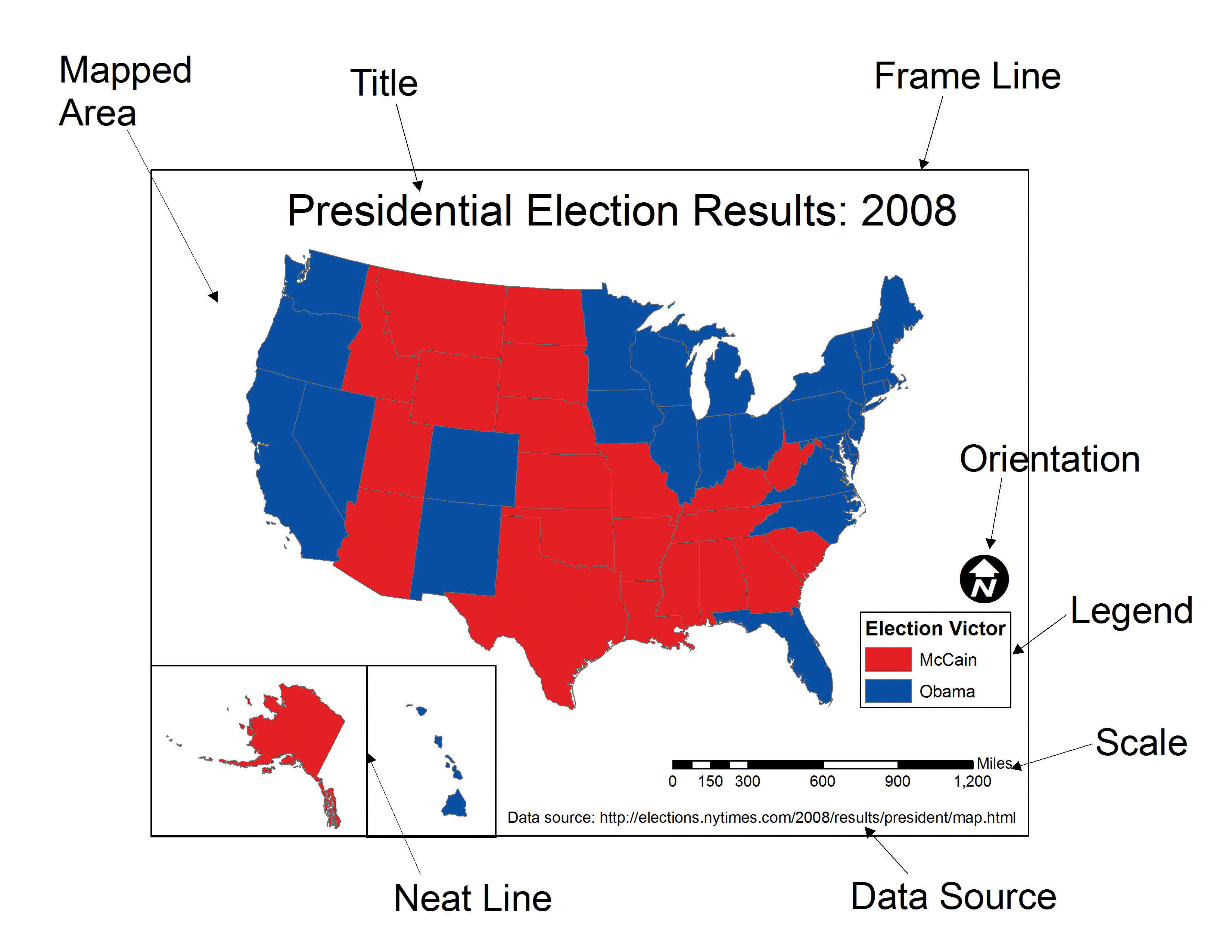
Before making any design decisions, answer these three questions:
- Who is my audience? — Experts need detail and precision; a general audience needs simplicity and clear labels.
- What is my message? — State it in one sentence. Maps that try to show everything communicate nothing.
- Where will it be displayed? — Web maps can be interactive; print maps are static and must work at a fixed size; presentation slides need bold, simple visuals.
Visual Hierarchy
Visual hierarchy controls what the viewer notices first, second, and last. A well-structured hierarchy guides the eye toward the most important information without effort.
| Visual tool | Effect | Practical use |
|---|---|---|
| Size | Larger elements draw attention first | Make your primary data layer the most prominent |
| Color | Brighter or contrasting colors stand out | Reserve saturated colors for key data; mute the basemap |
| Position | Central elements are noticed before edges | Place the main map center-frame |
| Contrast | Strong differences signal importance | High contrast between data and background |
In practice: bold, saturated colors for your data layer; muted tones for the basemap; labels that are legible but visually subordinate.
Visual Variables
Visual variables are the properties used to encode data on a map. Choosing the right one for your data type is one of the most important decisions in map design.
| Visual variable | Best data type | Example |
|---|---|---|
| Color hue (distinct colors) | Categorical / nominal | Land use types, political parties |
| Color value (light → dark) | Quantitative / ordered | Population density, income levels |
| Size | Quantitative at point locations | City population, earthquake magnitude |
| Shape | Categorical at point locations | Hospital vs. school vs. fire station |
| Orientation | Directional data | Wind direction, flow arrows |
| Texture / pattern | Categorical areas (especially print) | Zoning districts, vegetation types |
Rule of thumb: Quantitative data (numbers with order) → color value or size. Categorical data (named groups, no order) → color hue, shape, or texture.
Colors on Maps
Color is the most powerful visual variable — and the most commonly misused. The right color scheme depends on the type of data.
- Sequential — low to high values; light to dark (e.g., pale yellow → dark red for population density).
- Diverging — values that vary around a midpoint; two directions from a neutral center (e.g., blue–white–red for temperature anomaly).
- Categorical — distinct groups with no order; visually distinct hues (e.g., land cover classes).
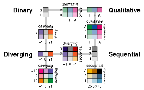
Best practices:
- Lighter shades for lower values, darker for higher — this matches most readers’ intuition.
- Always use colorblind-friendly palettes. About 8% of men have some form of color vision deficiency, and red-green combinations are the most common problem.
- Ensure sufficient contrast between adjacent classes so boundaries are visible.
- When in doubt, use ColorBrewer — it provides palettes that are colorblind-safe, print-friendly, and photocopy-safe.
Scale
Map scale defines the relationship between distance on the map and distance on the ground.
- Large-scale maps cover a small area with high detail (e.g., a neighborhood at 1:5,000).
- Small-scale maps cover a large area with less detail (e.g., a world map at 1:50,000,000).
Scale determines what level of detail is visible and appropriate. Features that look correct at one scale can be misleading at another — a neighborhood-level pattern should not be inferred from a country-level map. Always include a scale bar so readers can estimate real-world distances.
Projections
A map projection transforms the curved surface of the Earth onto a flat plane. Because you cannot flatten a sphere without distortion, every projection sacrifices at least one property: area, shape, distance, or direction.
| Projection family | What it preserves | Common use |
|---|---|---|
| Equal-area (Albers, Mollweide) | Area | Thematic maps where region size comparison matters |
| Conformal (Mercator, Lambert) | Local shape and angles | Navigation, topographic maps |
| Equidistant (Azimuthal equidistant) | Distance from a central point | Radial distance maps |
| Compromise (Robinson, Winkel Tripel) | None perfectly, but minimizes all | General-purpose world maps |
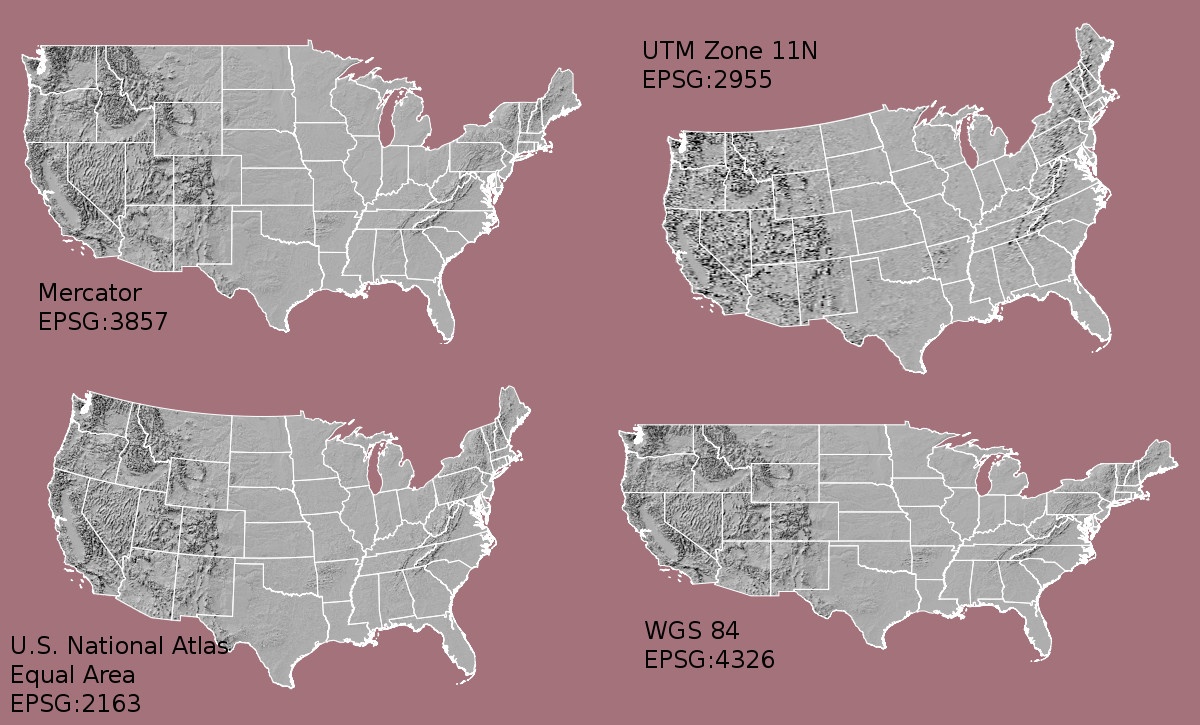
To see how dramatically Mercator distorts apparent country size, try The True Size Of…. Drag Russia down to where Africa sits — the difference is striking.
Tip
There is no “correct” projection — only projections suited to specific purposes. For U.S. Census and demographic work, the Albers Equal Area Conic is standard because it preserves area relationships between states and counties.
Labeling and Legends
Labels and legends transform a spatial image into a readable map.
Labels: Use readable font sizes, avoid overlapping features, apply halos (white outlines) for legibility over varied backgrounds, and size labels hierarchically — major features larger, minor features smaller.
Legends: Every encoded variable must be explained.
Use plain language (not variable codes like B19013_001E),
include units, and order entries logically — low to high for sequential
data, alphabetically for categories.
When to omit elements: Skip a north arrow if north is obviously up. Skip a scale bar on schematic maps where exact distance is not the point. When in doubt, include it — a reader who does not need it will ignore it; a reader who does need it will be stuck.
Thematic Map Types
Choosing the wrong map type for your data is one of the most common cartographic errors. Here are the most common types.
Choropleth Maps
Uses color value (light to dark) across geographic regions.
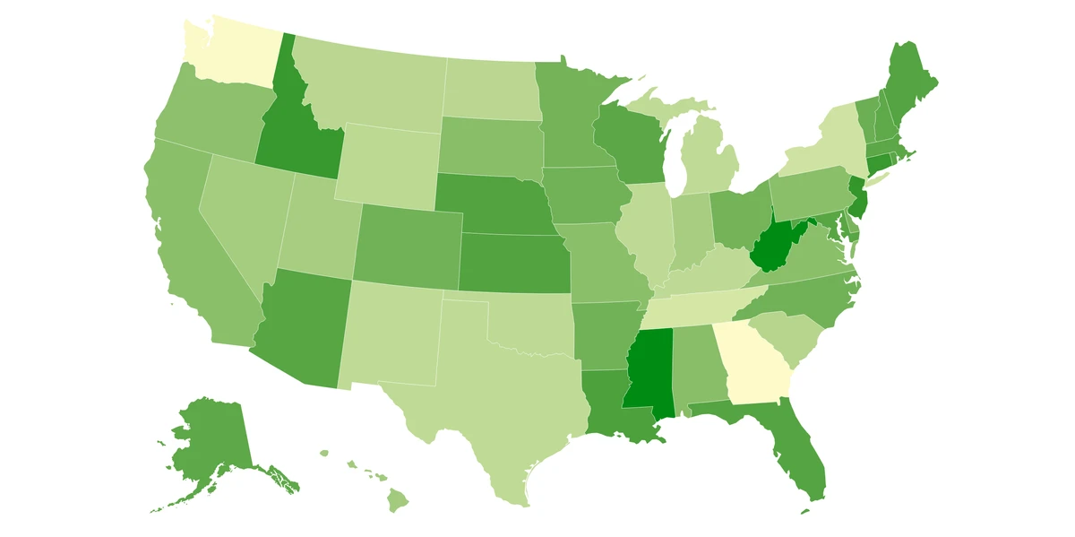
Best for: Rates, ratios, and normalized data — population per square km, median income, percentage with a college degree. Avoid for: Raw counts. Larger regions will almost always have higher counts, making the map reflect area rather than the phenomenon. Always normalize before using a choropleth.
Proportional Symbol Maps
Scales a symbol (typically a circle) at each location in proportion to a data value.
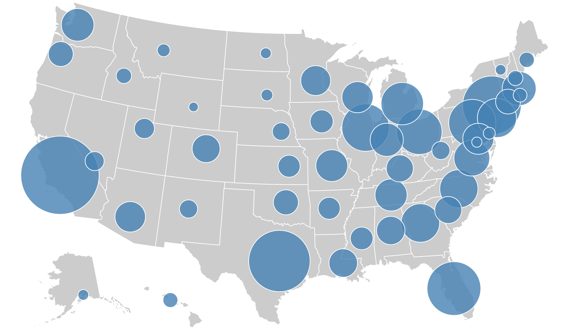
Best for: Comparing absolute magnitudes across discrete locations — total city population, number of cases per hospital. Avoid for: Continuous phenomena that cover entire regions.
Dot Density Maps
Places dots within each geographic unit, where each dot represents a set quantity.
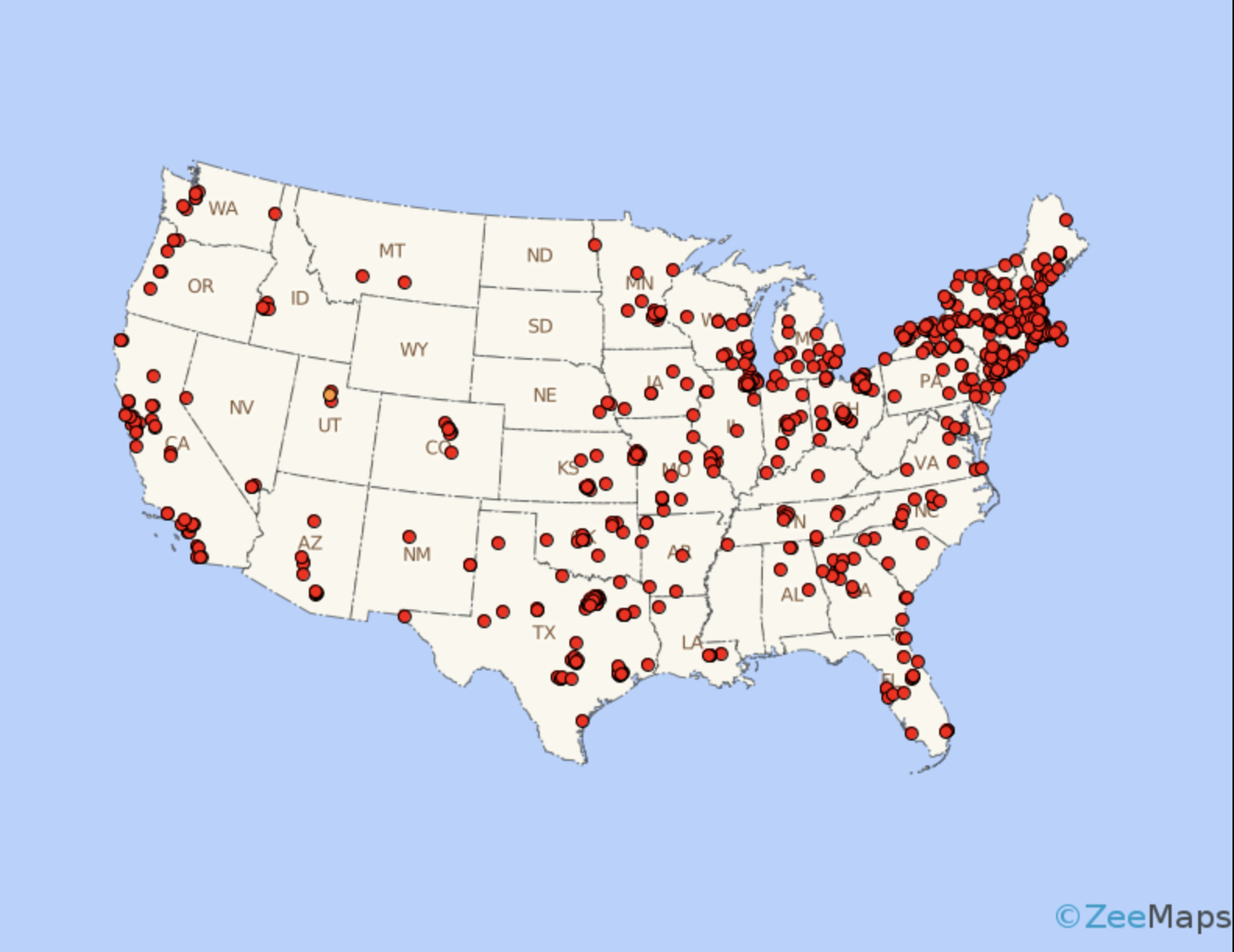
Best for: Showing spatial distribution and relative density — e.g., one dot = 1,000 people. Avoid for: Precise counts or when unit boundaries would create artificial clustering.
Non-Contiguous Cartograms
Resizes each region in proportion to a data value and separates them so outlines remain recognizable.
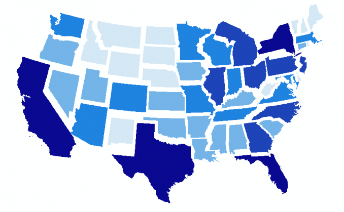
Best for: Emphasizing magnitude (GDP, electoral votes) when geographic area would otherwise dominate. Note: Readers unfamiliar with cartograms may find them disorienting — include a brief explanation.
Multivariate Maps
Encodes two or more variables simultaneously using different visual channels.
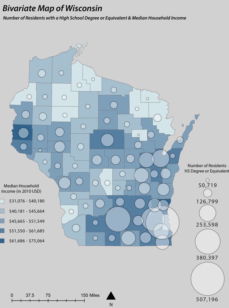
Best for: Exploring the relationship between two variables — e.g., income (color) alongside education (symbol size). Use with caution: Limit to two variables when possible. A third should only be added if the three-way relationship is genuinely the story.
Data Classification Methods
When creating a choropleth, continuous data must be grouped into classes (typically 4–7) so distinct colors can be assigned. The method you choose has a large effect on the visual pattern — and therefore on the story the map appears to tell.
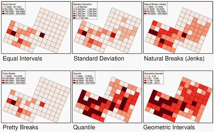
| Method | How it works | Best for | Watch out for |
|---|---|---|---|
| Equal Interval | Divides the full range into bins of equal width | Evenly distributed data | Misleading with skewed data — most observations may fall in one or two classes |
| Quantile | Places an equal number of observations in each class | Ranking and relative comparison | Similar values can end up in different classes |
| Natural Breaks (Jenks) | Finds boundaries at natural gaps in the distribution | Clustered or uneven data | Boundaries shift if the data changes |
| Standard Deviation | Classes defined by distance from the mean | Highlighting anomalies and extremes | Requires the audience to understand standard deviations |
When in doubt, start with Natural Breaks. It tends to produce the most honest representation of the underlying data structure.
Choosing a Classification Method
You have U.S. county median household income data ranging from $25,000 to $150,000. Most counties cluster between $45,000 and $75,000, with a small number of very high-income outliers.
- Which classification method would you choose and why?
- Which method would produce the most misleading map, and what would it get wrong?
Static vs. Interactive Maps
Decide your display format before making other design choices.
| Feature | Static map | Interactive map |
|---|---|---|
| Zoom and pan | No | Yes |
| Layer toggling | No | Yes |
| Hover for details | No | Yes |
| Print quality | High | Varies |
| Design control | Full | Partial |
| Development effort | Low | Higher |
| Best for | Single clear message | User-driven exploration |
Use static maps when you want to communicate one message as clearly as possible. Use interactive maps when readers need to explore, filter, or look up specific values. In this workshop we focus primarily on static maps produced in QGIS.
Ethical Considerations
Visualizations can influence policy, investment, and public opinion. That creates responsibility.
- Avoid cherry-picking — selecting only the time window or subset that supports your conclusion is dishonest, even if every data point shown is accurate.
- Disclose sources and limitations — always cite the data source, note the date range, sample size, and known gaps.
- Respect privacy — geospatial and demographic data can expose individuals even when names are removed. Consider aggregation levels carefully.
- Consider unintended consequences — a crime-rate map, for example, can reinforce stereotypes if presented without context about policing patterns or historical disinvestment.
Cartography Checklist
Before finalizing any map, work through this list:
- Data visualization turns numbers into stories the human brain can process quickly — but poor design can mislead more powerfully than raw data.
- Every map is a communication tool; define your audience, message, and medium before making design decisions.
- Match your thematic map type to your data: choropleth for normalized rates, proportional symbols for magnitudes, dot density for distributions.
- Color scheme, projection, and classification method choices directly affect what a map appears to say — choose intentionally.
- Run through the cartography checklist before publishing any map.