
All in One View
Content from Exercises: NDVI Analysis with Sentinel-2 Imagery
Last updated on 2026-06-28 | Edit this page
Overview
Questions
- What is NDVI and what does it measure?
- How do I calculate NDVI from Sentinel-2 bands in QGIS?
- How do I interpret and visualize NDVI results?
Objectives
- Understand what NDVI measures and why it is useful
- Load individual Sentinel-2 spectral bands into QGIS
- Use the Raster Calculator to compute NDVI from red and near-infrared bands
- Apply pseudocolor symbology to interpret vegetation health
- Compare NDVI results against satellite basemap imagery
Introduction
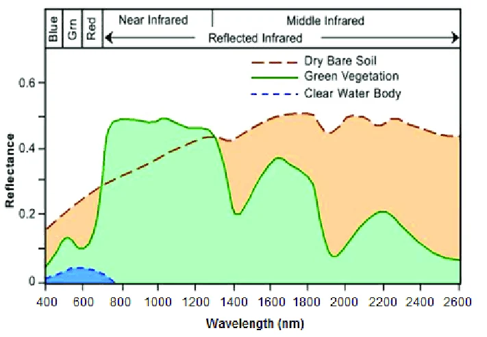
A Normalized Difference Vegetation Index (NDVI) is a widely used landscape metric that quantifies the health and density of vegetation using satellite sensor data. It works by comparing the reflectance of red light (which vegetation absorbs) and near-infrared light (which healthy vegetation strongly reflects). The formula is:
NDVI = (NIR − Red) / (NIR + Red)
NDVI values range from −1 to +1. Values near +1 indicate dense, healthy vegetation; values near 0 indicate bare soil or sparse cover; and negative values typically indicate water, clouds, or snow.
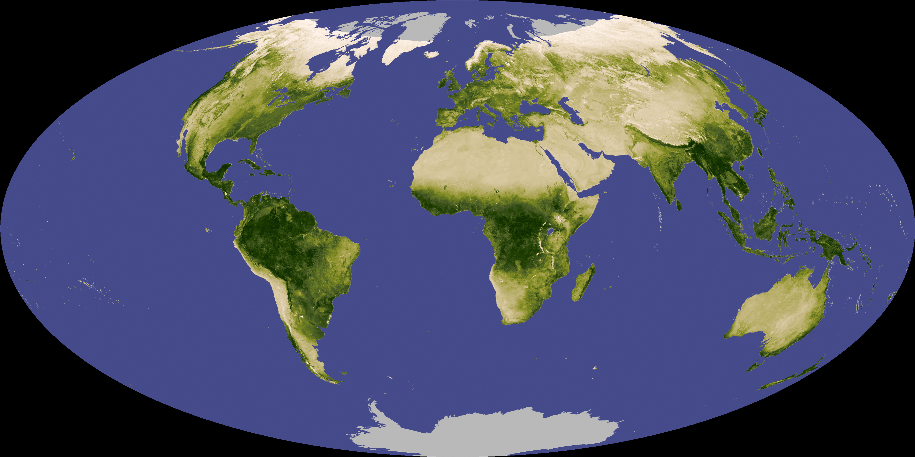
In this exercise we will use a Sentinel-2 multispectral image to calculate NDVI for a region in south-central Kansas.
ESRI Sentinel 2 Atlas
Take a moment to explore Sentinel-2 Land Cover Living Atlas. Take a note of its features!
Esri’s Sentinel-2 platform in the ArcGIS Living Atlas is a free, web-based tool that provides dynamic access to global, multi-spectral satellite imagery. It features a rolling 14-month archive of the best, most cloud-free scenes, which update daily at a 10-meter spatial resolution.
Step 1: Set Up Your Project
- Create a folder on your desktop called NDVI_Analysis (if you have not already done so from the setup page).
- Open QGIS, close any pop-ups, and go to Project → Save
As. Save the project as
NDVI_Projectinside your NDVI_Analysis folder.
Step 2: Download and Extract the Sentinel-2 Image
Navigate to the workshop’s shared resources Google Drive. Under Day 1_Session 3a: Basic raster functions, download the ZIP file:
S2B_MSIL1C_20260617T170849_N0512_R112_T14SPG_20260617T203803.SAFE.zip-
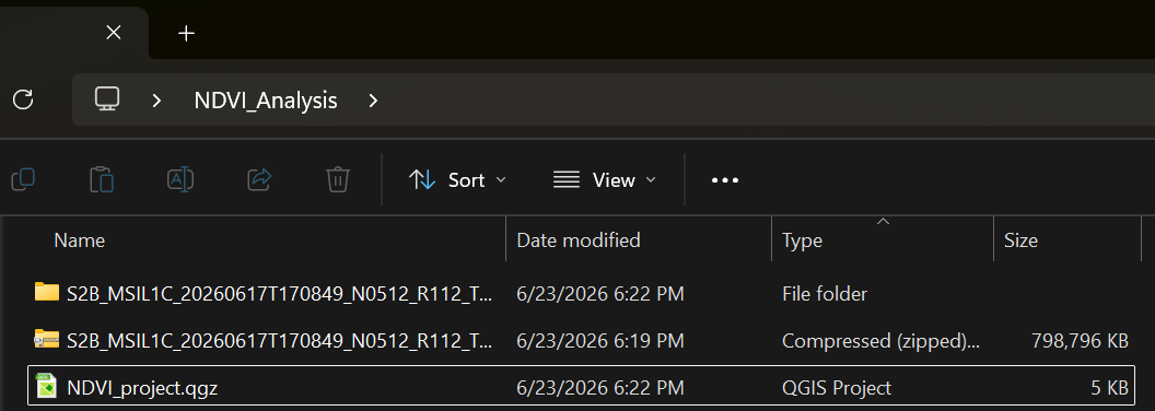
Save the ZIP file to your NDVI_Analysis folder and extract it:
- Windows: Right-click → Extract All
- Mac: Double-click the ZIP file
Step 3: Load the Red and NIR Bands
Sentinel-2 images contain 13 spectral bands stored as individual files. For NDVI we only need two:
-
Band 4 (Red) —
T14SPG_20260617T170849_B04.jp2 -
Band 8 (Near-Infrared) —
T14SPG_20260617T170849_B08.jp2
To find them:
- In the Browser Panel on the left side of QGIS, navigate to: Project Home → S2B_MSIL1C_…SAFE → GRANULE → L1C_T14SPG_… → IMG_DATA
- Drag B04 and B08 into the Layers Panel.
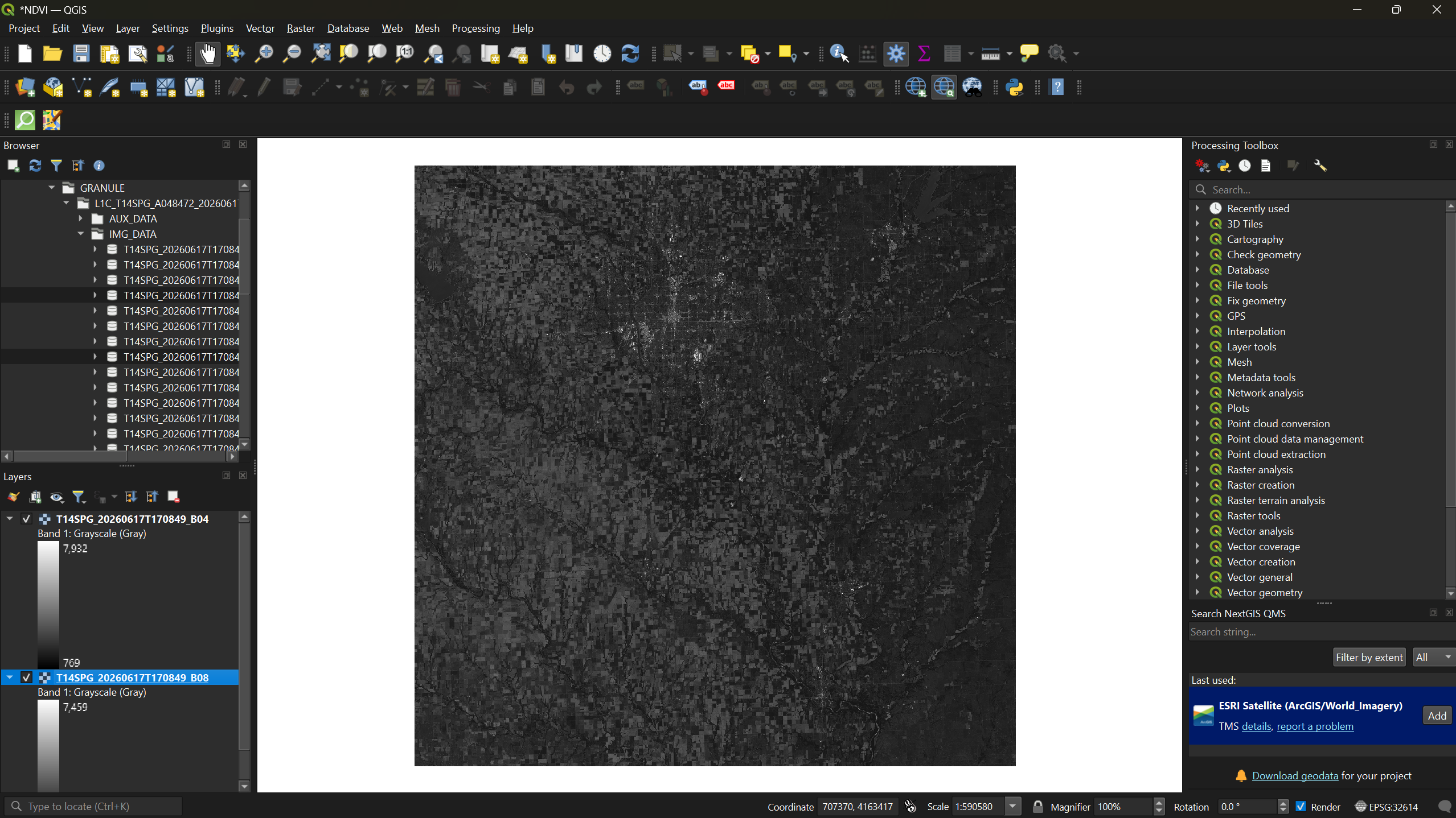
Toggle each layer’s visibility using the checkbox next to its name to see how the two bands differ — Band 4 captures visible red light, while Band 8 captures near-infrared reflectance that is invisible to the human eye but strongly reflected by healthy vegetation.
Step 4: Calculate NDVI with the Raster Calculator
- From the menu bar, select Raster → Raster Calculator.
- In the expression box, enter the NDVI formula. You can double-click the band names in the Raster Bands list to insert them:
( "T14SPG_20260617T170849_B08@1" - "T14SPG_20260617T170849_B04@1" ) / ( "T14SPG_20260617T170849_B08@1" + "T14SPG_20260617T170849_B04@1" )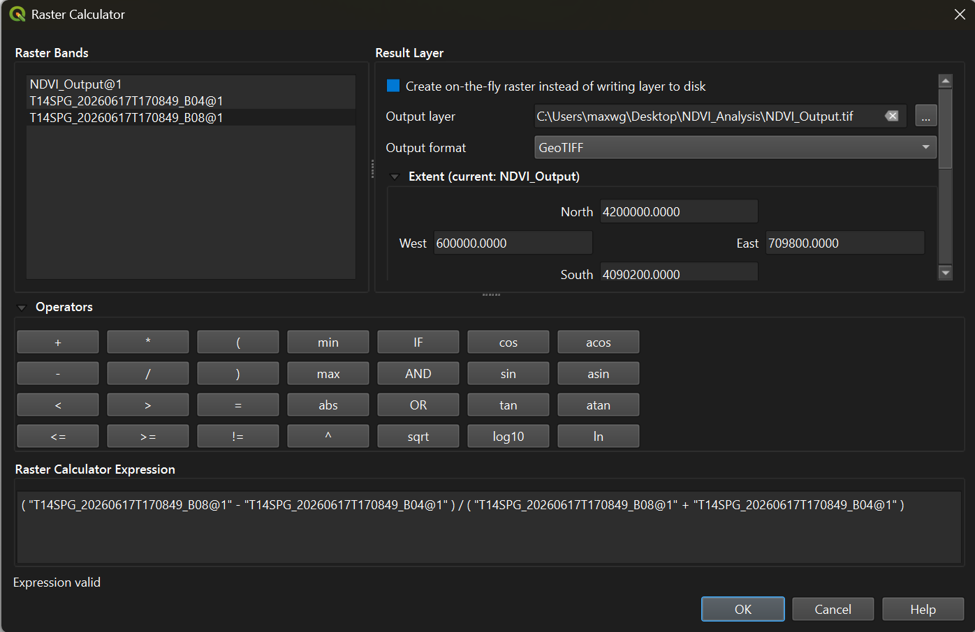
- Click the three-dot button next to Output layer and
save it as
NDVI_Outputin your NDVI_Analysis folder. - Click OK to run the calculation.
Once the output loads, you can right-click Bands 4 and 8 in the Layers Panel and select Remove Layer — they are no longer needed.
Step 5: Apply Color Symbology
The raw NDVI output appears in grayscale. To make vegetation patterns visible, we need to apply a color ramp.
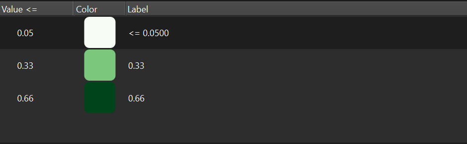
- Right-click the
NDVI_Outputlayer → Properties → Symbology tab. - Change the Render type to Singleband pseudocolor.
- Set Interpolation to Discrete.
- Set the Color ramp to Greens.
- Under the table, set the Mode to Equal Interval and reduce the Classes to 3.
- In the Value column, enter the following from
bottom to top:
0.66,0.33,0.05. - Click Apply.
Step 6: Refine the Color Scheme
The green-only ramp shows the classification, but we can make interpretation more intuitive by matching colors to vegetation health levels.
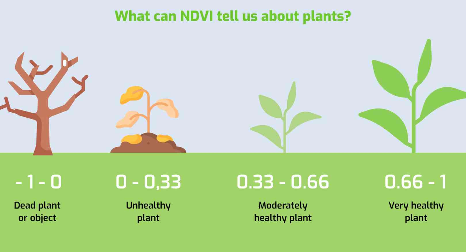
Using the reference scale above as a guide:
- Reopen the Symbology tab.
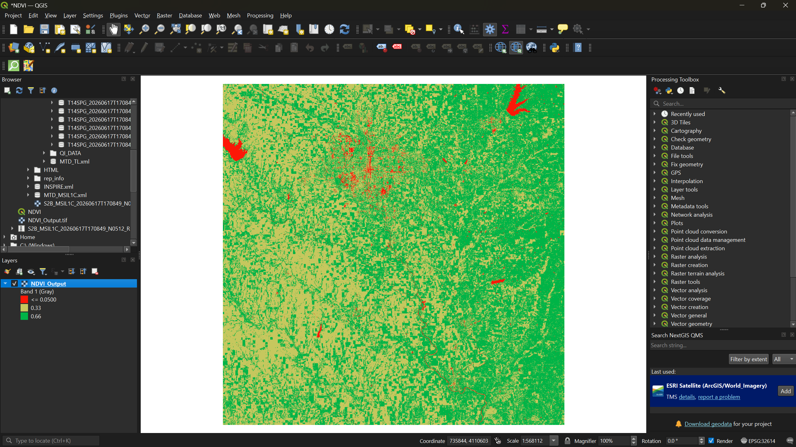
- Double-click each color swatch to change it:
- Bottom class (0.05–0.33) → Red — inanimate objects, bare soil, or dead vegetation
- Middle class (0.33–0.66) → Yellow — unhealthy or sparse vegetation
- Top class (0.66–1.0) → Green — dense, healthy vegetation
- Click Apply, then OK.
Exercise 1: Interpret the NDVI Map
Look at your NDVI output and try to answer the following:
- Can you identify Wichita (the largest city in the region)? What NDVI values dominate urban areas?
- Can you locate any lakes or rivers? What values do they show?
- Where is the densest vegetation — is it farmland, forest, or something else?
Write down your initial observations. We will check them against satellite imagery in the next step.
Step 7: Add a Basemap for Comparison
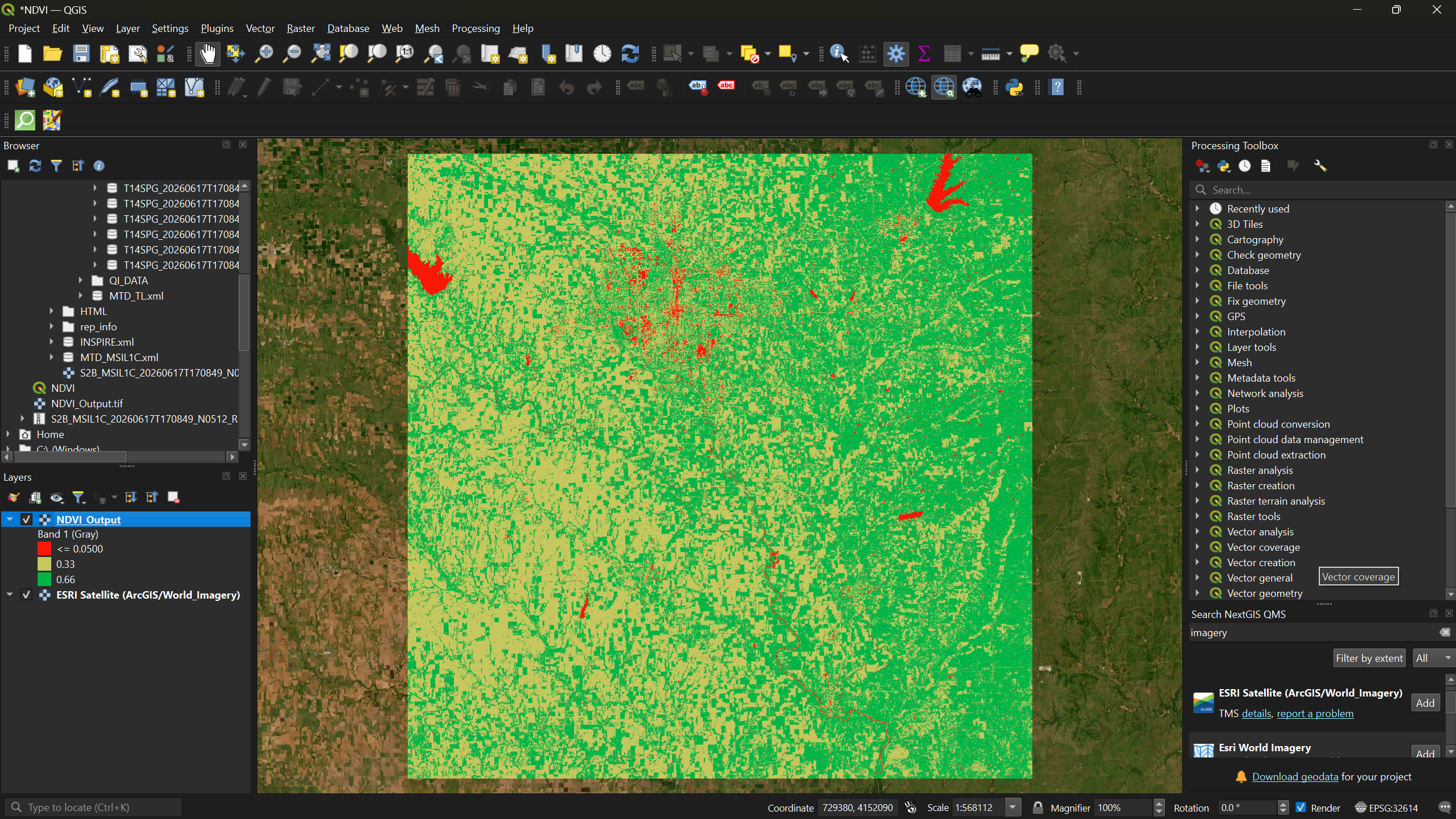
To verify your interpretations, add a satellite basemap underneath the NDVI layer.
- From the menu bar, select Plugins → Manage and Install Plugins.
- Search for QuickMapServices and click Install Plugin (if not already installed from Session 1a).
- After installation, a QMS panel should appear on
the right side of your screen. Search for
imageryand add Esri Satellite (ArcGIS/World_Imagery) to your map.
Now toggle the NDVI layer on and off in the Layers Panel to compare your NDVI classification against the actual satellite imagery.
Exercise 2: Verify Your Observations
Compare your NDVI results against the satellite basemap.
- Were your initial observations from Exercise 1 correct?
- Did anything surprise you — areas you expected to be vegetated that were not, or vice versa?
- Can you identify any agricultural fields? How do their NDVI values differ from surrounding natural vegetation?
- NDVI uses the ratio of near-infrared and red reflectance to quantify vegetation health and density.
- Sentinel-2 Bands 4 (Red) and 8 (NIR) are the inputs for NDVI calculation in QGIS.
- Refer to this Multispectral Band Combinations website here to learn what the function of each combination is!
- The Raster Calculator applies the NDVI formula on a per-pixel basis across the entire image.
- Thoughtful color symbology (red → yellow → green) makes NDVI results immediately interpretable.
- Comparing NDVI output against a satellite basemap helps validate your interpretation of the results.
Content from Exercises: Flood Analysis with False Color Composites and NDWI
Last updated on 2026-06-28 | Edit this page
Overview
Questions
- What is a false color composite and what does it reveal?
- How do I create a false color composite from Sentinel-2 bands in QGIS?
- What is NDWI and how does it differ from NDVI?
- How can NDWI help identify flood extent more accurately than a false color composite alone?
Objectives
- Understand how false color composites remap spectral bands to RGB channels to highlight landscape features
- Build a virtual raster in QGIS to create a false color composite from Sentinel-2 bands
- Calculate NDWI using the Raster Calculator to delineate water from non-water
- Compare FCC, NDWI, and satellite basemap imagery to assess flood extent
Introduction
In the previous episode we used NDVI to identify vegetation. In this episode we shift focus to water — specifically, how to identify the extent of flooding using two complementary techniques: False Color Composites (FCC) and the Normalized Difference Water Index (NDWI).
What Is a False Color Composite?
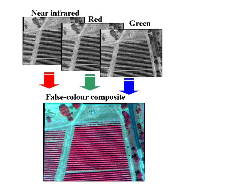
A true color image maps the red, green, and blue bands to their corresponding RGB screen channels, producing an image that looks like a normal photograph. A false color composite swaps one of those bands — typically replacing blue with near-infrared — so that features invisible to the human eye become visible on screen.
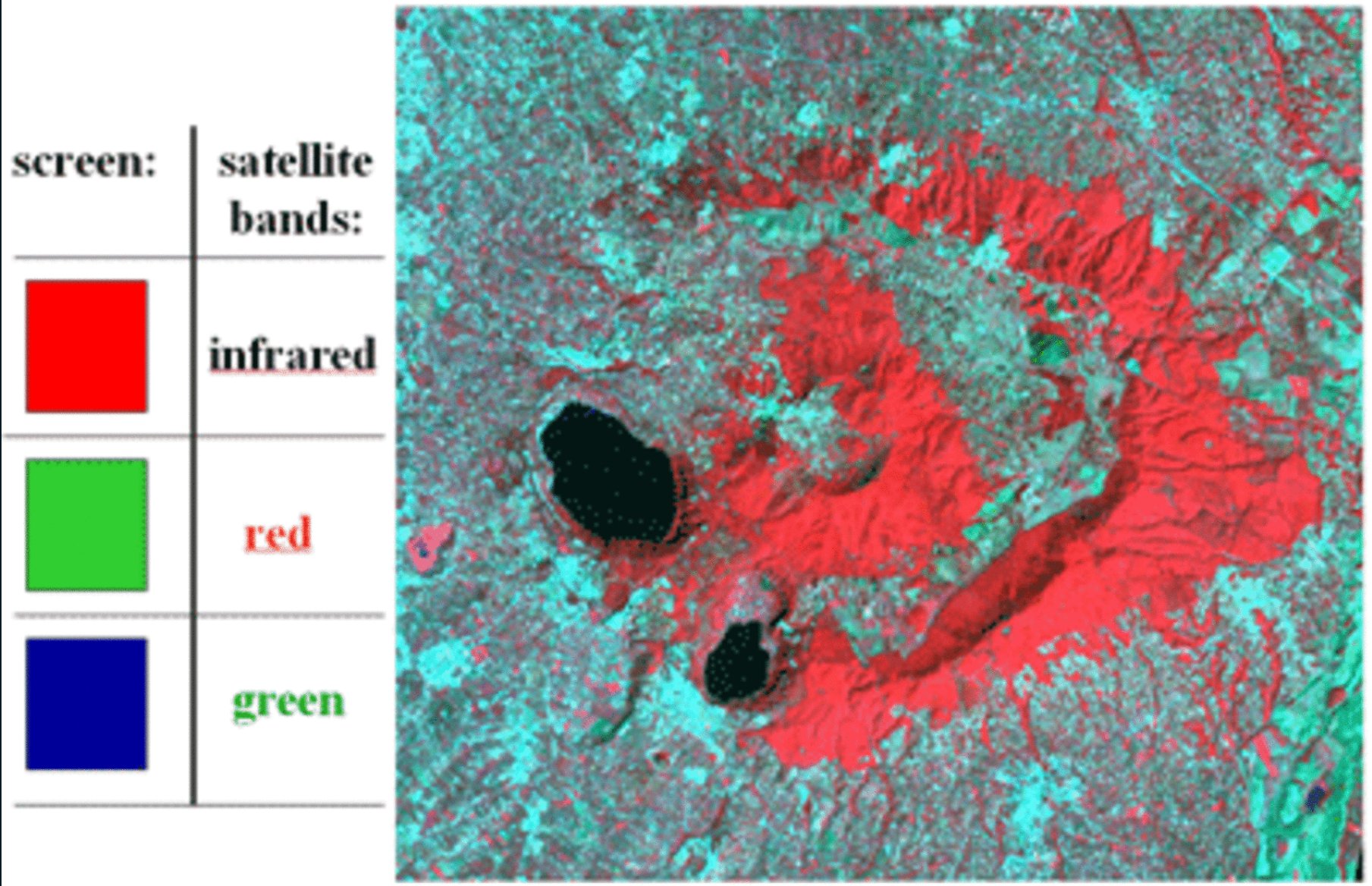
In a standard NRG false color composite (NIR → Red channel, Red → Green channel, Green → Blue channel):
- Vegetation appears red — because healthy vegetation strongly reflects near-infrared light, which is now displayed in the red channel
- Water appears dark blue to black — because water absorbs most near-infrared light
- Bare soil and infrastructure appear grey to white
What Is NDWI?
The Normalized Difference Water Index (NDWI) operates similarly to NDVI, but targets water rather than vegetation. It uses Sentinel-2 Bands 3 (Green) and 8 (Near-Infrared):
NDWI = (Green − NIR) / (Green + NIR)
Water absorbs near-infrared light but reflects green light, so water features produce positive NDWI values while non-water features produce negative values. This makes NDWI particularly useful for mapping flood extent, where muddy floodwater can appear ambiguous in both true and false color images.
Step 1: Set Up Your Project
- Create a folder on your desktop called Flood_Analysis.
- Open QGIS, close any pop-ups, and go to Project → Save
As. Save the project as
Flood_Projectinside your Flood_Analysis folder.
Step 2: Download and Extract the Sentinel-2 Image
Navigate to the workshop’s shared resources Google Drive. Under Day 1_Session 3a: Basic raster functions, download the ZIP file:
S2A_MSIL1C_20220831T055651_N0510_R091_T42RVR_20240719T213641.SAFE.zip-
Save the ZIP file to your Flood_Analysis folder and extract it:
- Windows: Right-click → Extract All
- Mac: Double-click the ZIP file
This image captures the Sindh province of Pakistan during the devastating 2022 floods.
Step 3: Load the Required Bands
To create both the FCC and the NDWI, we need three bands:
| Band | Wavelength | File name |
|---|---|---|
| Band 3 (Green) | ~560 nm | T42RVR_20220831T055651_B03.jp2 |
| Band 4 (Red) | ~665 nm | T42RVR_20220831T055651_B04.jp2 |
| Band 8 (NIR) | ~842 nm | T42RVR_20220831T055651_B08.jp2 |
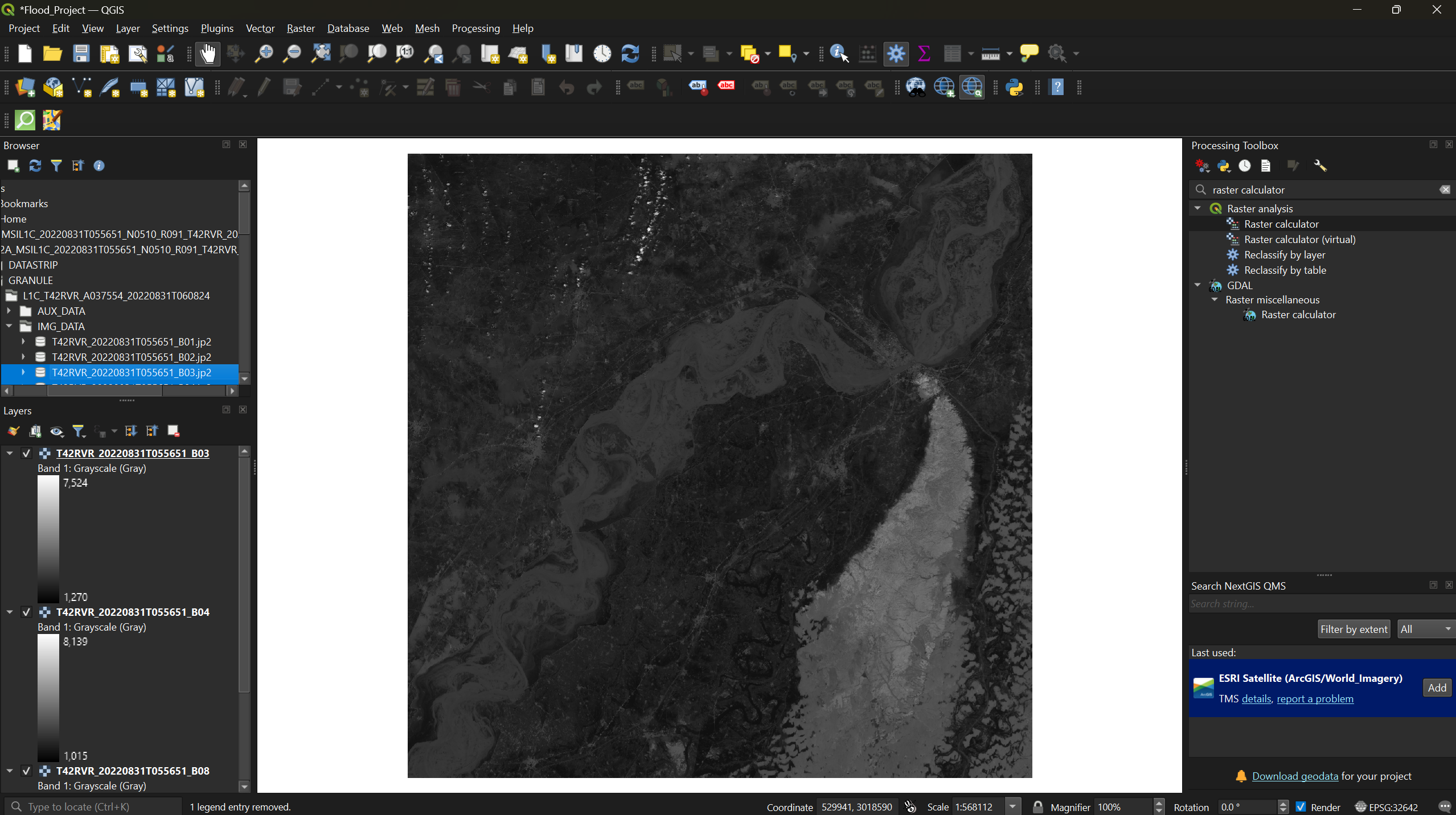
In the Browser Panel, navigate to: Project Home → S2A_MSIL1C…SAFE → GRANULE → L1C_T42RVR_… → IMG_DATA
Drag B03, B04, and B08 into the Layers Panel.
Step 4: Create the False Color Composite
To combine three single-band rasters into one multi-band image, we use a virtual raster.
- From the menu bar, select Raster → Miscellaneous → Build Virtual Raster.
- Click the three dots next to Input Layers and
arrange the bands by dragging them into this order:
- B08 (NIR — will map to the red channel)
- B04 (Red — will map to the green channel)
- B03 (Green — will map to the blue channel)
- Click Select All, then click the back arrow in the top-left corner of the pop-up.
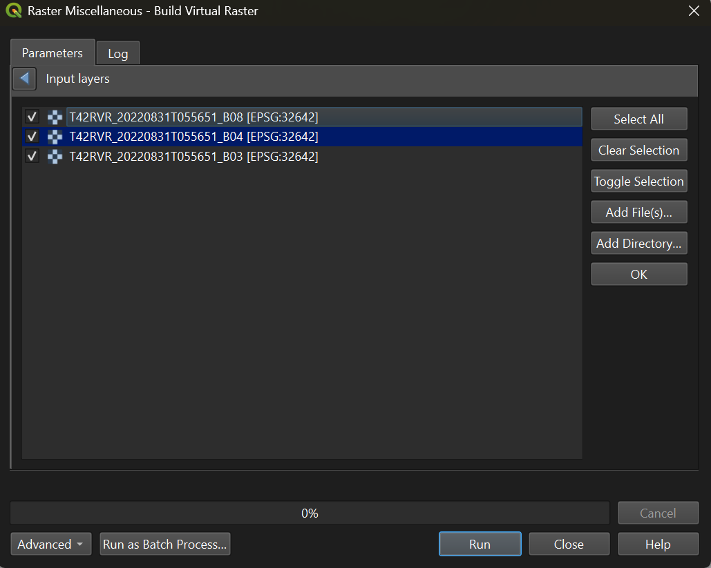
- Check the box Place each input file into a separate band.
- Under Virtual, click the three dots and select
Save to File. Save it as
Flood_Outputin your Flood_Analysis folder. - Click Run.
Once complete, uncheck B03, B04, and B08 in the Layers Panel to see the false color composite.
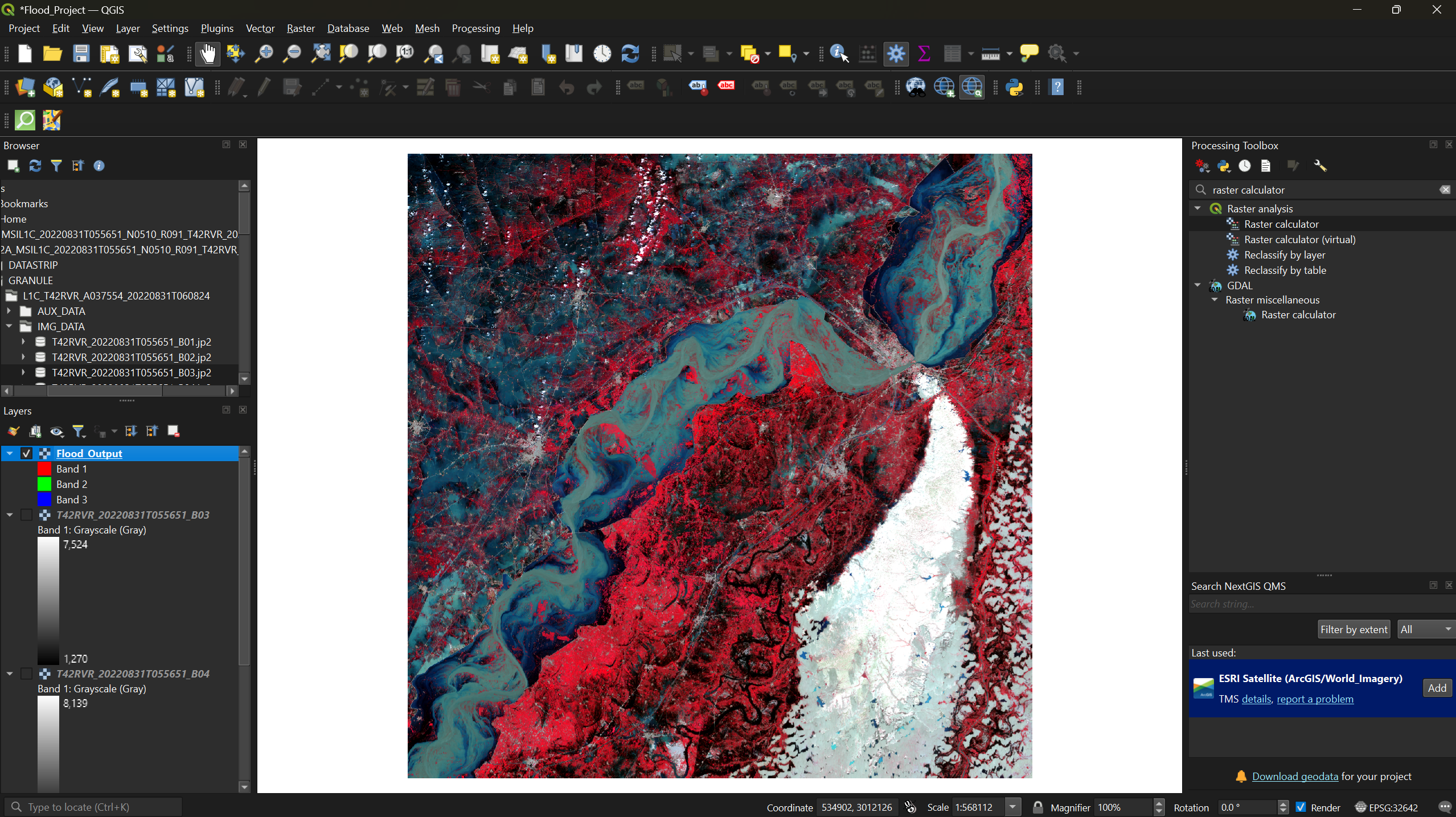
The red areas are vegetation, dark blue and black areas are water, and grey-to-white areas are bare soil and infrastructure.
Step 5: Compare Against a Satellite Basemap
Add a basemap to compare the FCC against post-flood satellite imagery.
- If you have not already installed QuickMapServices, go to Plugins → Manage and Install Plugins, search for QuickMapServices, and install it.
- Open the QMS panel (the globe-with-magnifying-glass icon in the
toolbar), search for
imagery, and add Esri Satellite (ArcGIS/World_Imagery).
Toggle the Flood_Output layer on and off to compare the
flooded landscape to post-flood imagery.
Exercise 1: Interpret the False Color Composite
- How accurate is the FCC at showing flood extent? Can you identify areas that were clearly underwater?
- What does the FCC struggle to distinguish? Look carefully at lighter blue areas — are they floodwater, or bare soil?
- What was the approximate extent of flooding in this region?
Step 6: Calculate NDWI
The FCC provides a useful overview, but it has a limitation: muddy floodwater often appears as a lighter blue-grey that is difficult to distinguish from bare soil or infrastructure. NDWI solves this by isolating water based on its spectral signature rather than relying on visual color interpretation.
- From the menu bar, select Raster → Raster Calculator.
- Enter the NDWI formula in the expression box (double-click band names to insert them):
( "T42RVR_20220831T055651_B03@1" - "T42RVR_20220831T055651_B08@1" ) / ( "T42RVR_20220831T055651_B03@1" + "T42RVR_20220831T055651_B08@1" )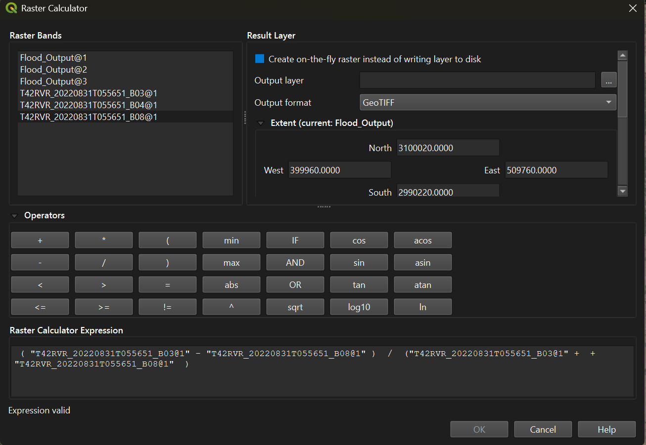
- Click the three-dot button next to Output layer and
save it as
NDWI_Outputin your Flood_Analysis folder. - Click OK to run the calculation.
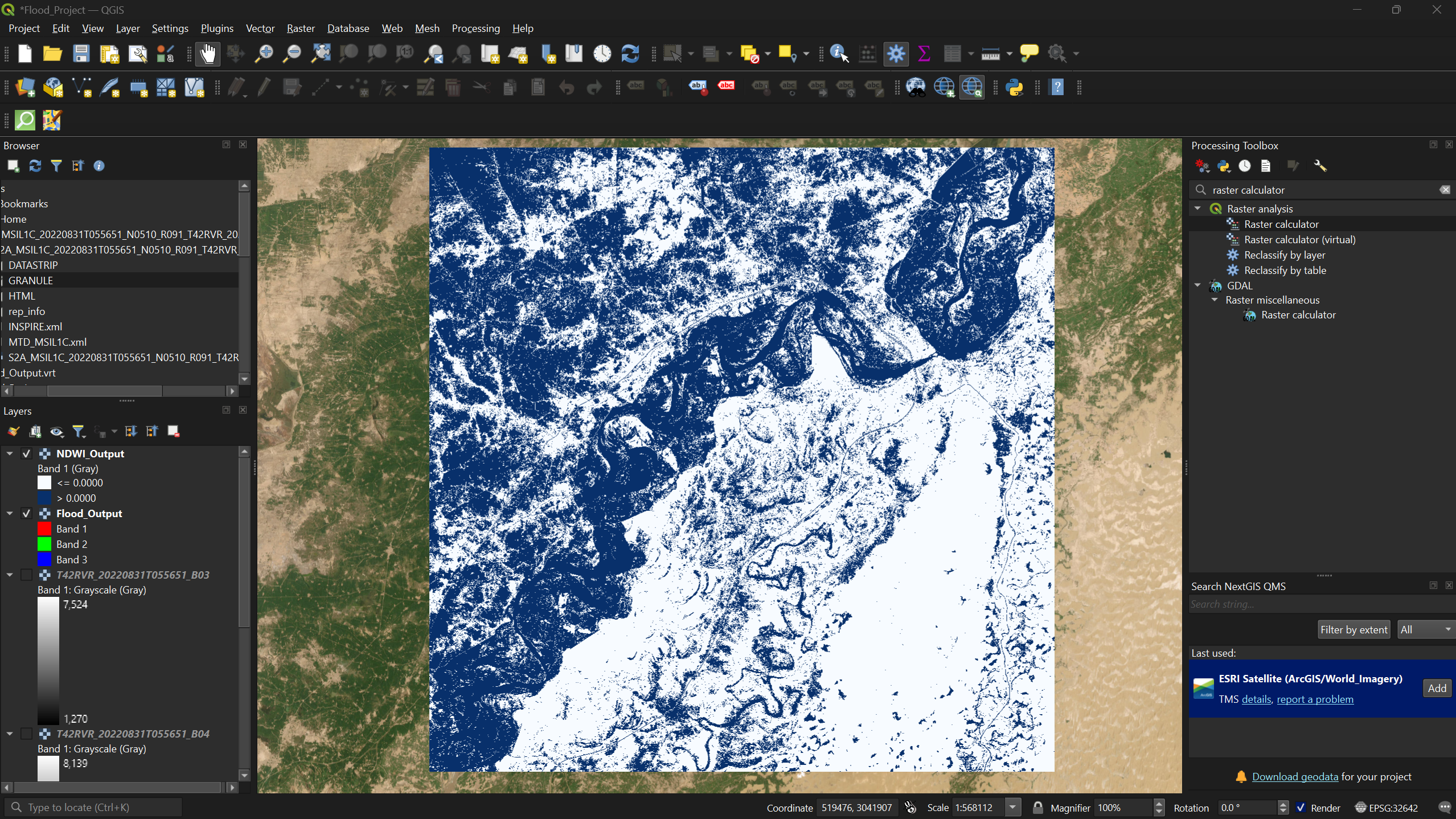
Step 7: Apply Symbology to the NDWI Output
- Right-click the
NDWI_Outputlayer → Properties → Symbology tab. - Change the Render type to Singleband pseudocolor.
- Set Interpolation to Discrete.
- Set the Color ramp to Blues.
- Set the Mode to Equal Interval and reduce Classes to 2.
- In the Value column, set the first value to
0— this creates a clean split between water (positive values, blue) and non-water (negative values). - Click Apply.
Step 8: Overlay NDWI on the False Color Composite
To directly compare how much water the NDWI detected versus what the FCC shows, we can make the non-water class transparent so only detected water is visible over the FCC.
- Reopen the Symbology tab for
NDWI_Output. - Right-click the color swatch for the first value (the non-water class) → Change Opacity → set to 0.
- Click Apply.
- In the Layers Panel, make sure
Flood_Output(the FCC) is turned on and positioned belowNDWI_Output.
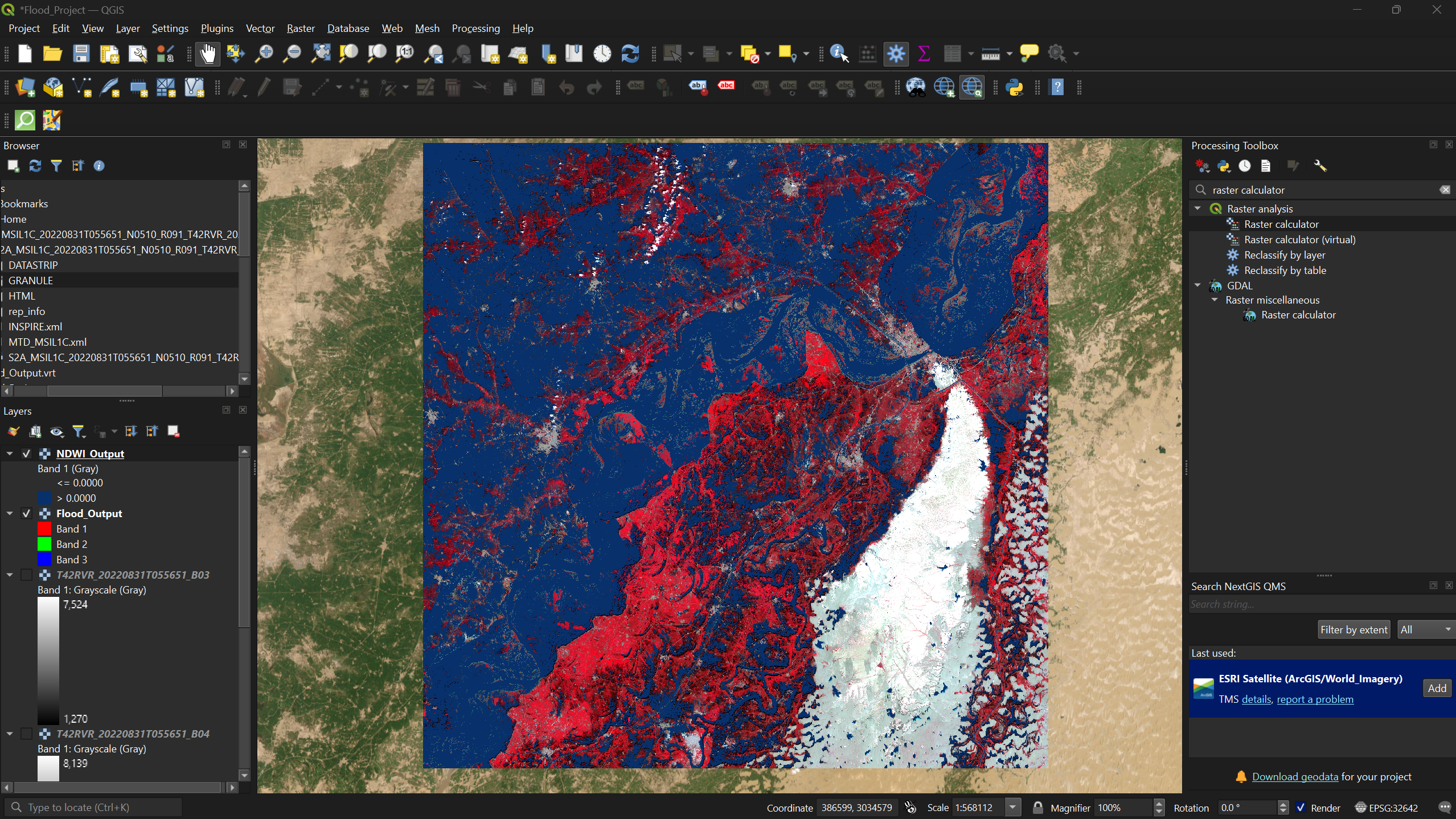
The blue areas are pixels the NDWI identified as water. You can now see exactly where the NDWI detected flooding that may have been ambiguous in the FCC alone.
Exercise 2: Compare All Three Layers
Toggle between the NDWI overlay, the FCC, and the Esri satellite basemap to answer the following:
- Does the NDWI detect flood extent that the FCC missed? Where?
- Are there areas where the NDWI may have incorrectly classified non-water as water (false positives)?
- What are the strengths and limitations of each method? When would you use FCC versus NDWI?
- False color composites remap spectral bands to RGB channels, making vegetation (red), water (dark blue), and bare soil (grey/white) visually distinct.
- FCC is a quick visual tool but struggles with muddy or shallow floodwater that appears similar to bare soil.
- NDWI uses the ratio of green and near-infrared reflectance to isolate water features, providing a more reliable delineation of flood extent.
- Overlaying NDWI on an FCC combines the strengths of both methods — spectral precision from NDWI and spatial context from the FCC.