
All Images
Acquiring Vector Datasets from Data Repositories
Exercise 1a: Acquiring Data and Making Your First Map in QGIS
Figure 1
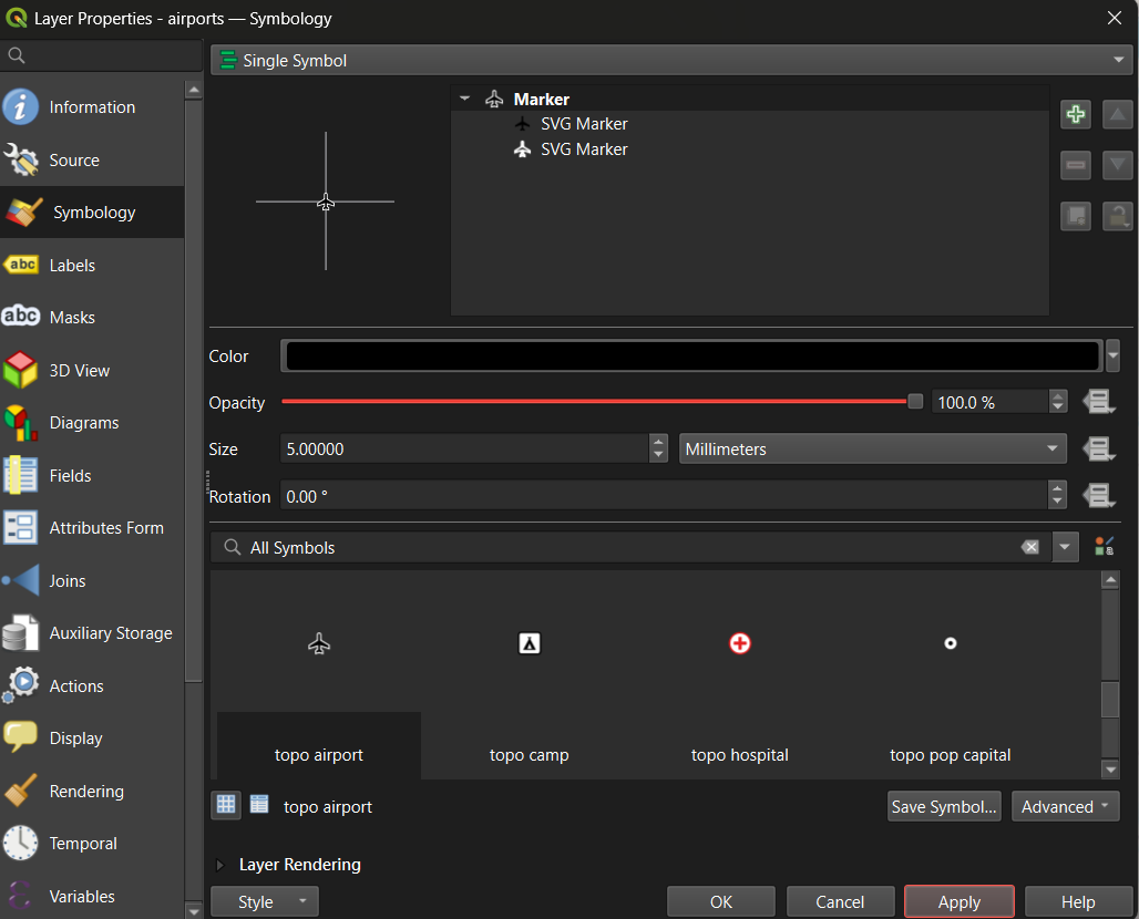
The QGIS Symbology panel showing marker style,
size, and color options for the airports layer.
Figure 2
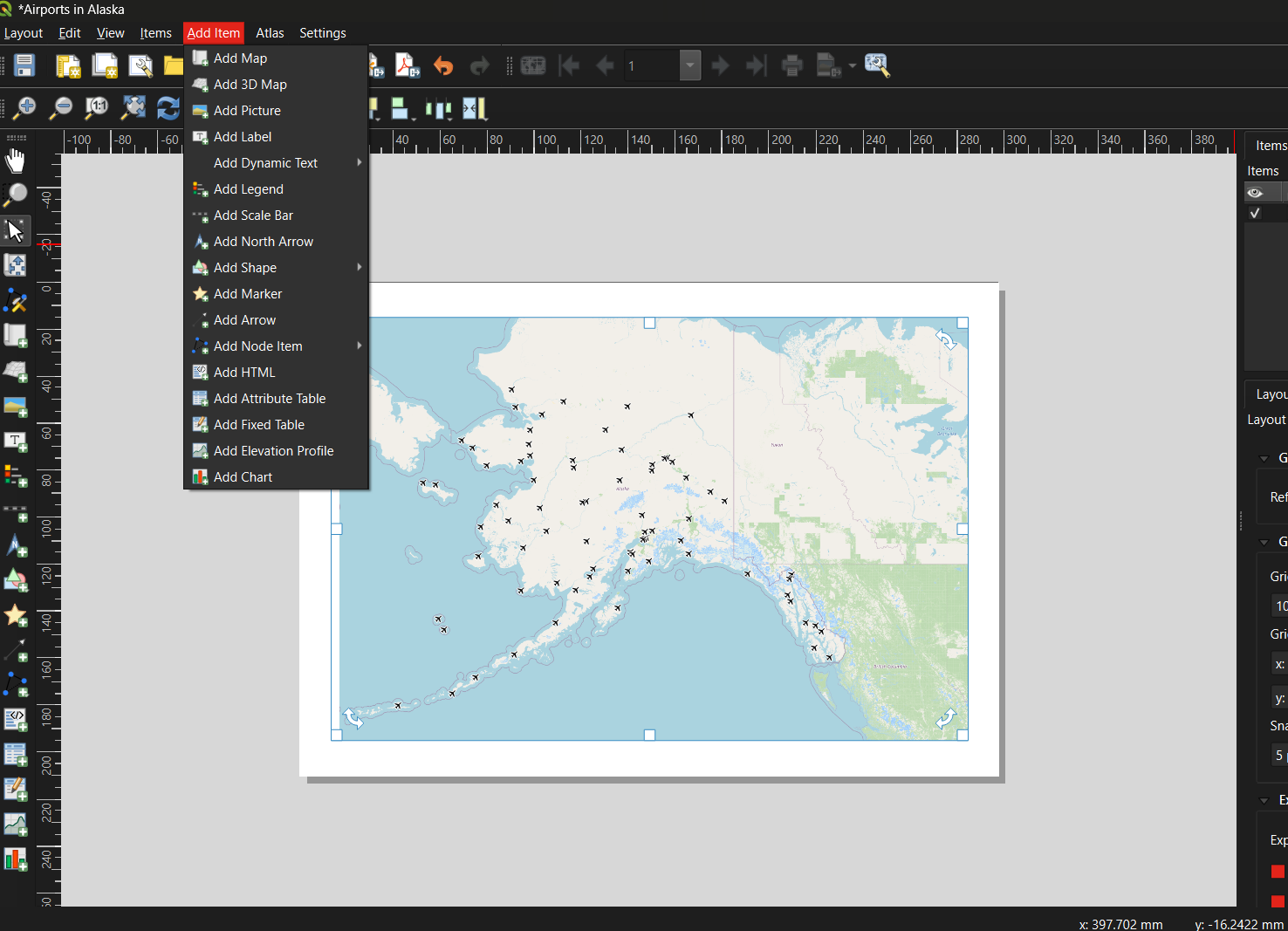
The QGIS Print Layout window showing a map and
option to add title, legend, scale bar, and north arrow.
Figure 3
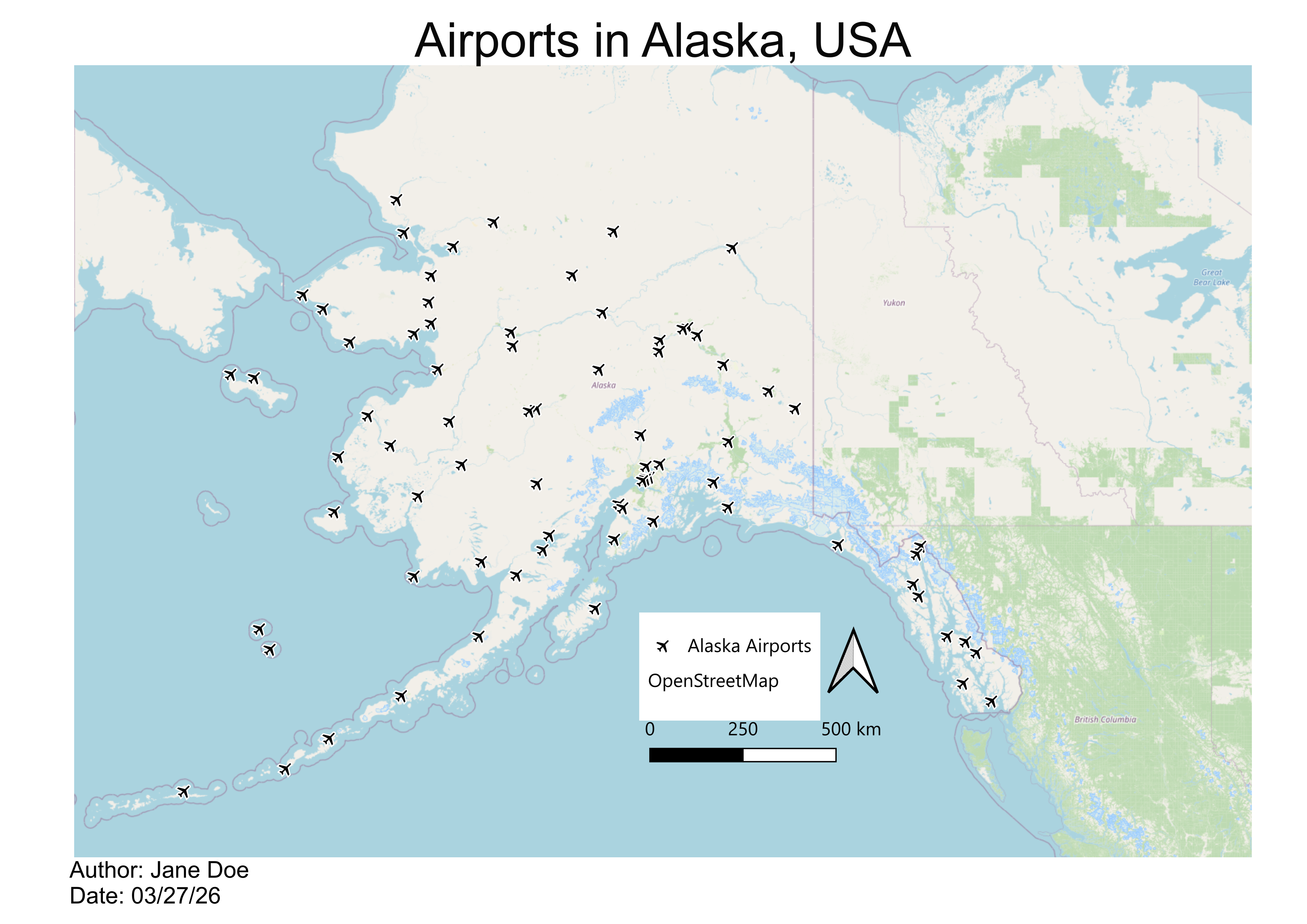
A finished map showing 76 airports in Alaska as
point symbols, with a title, legend, scale bar, north arrow, and data
credit.
Additional Reading
Figure 1
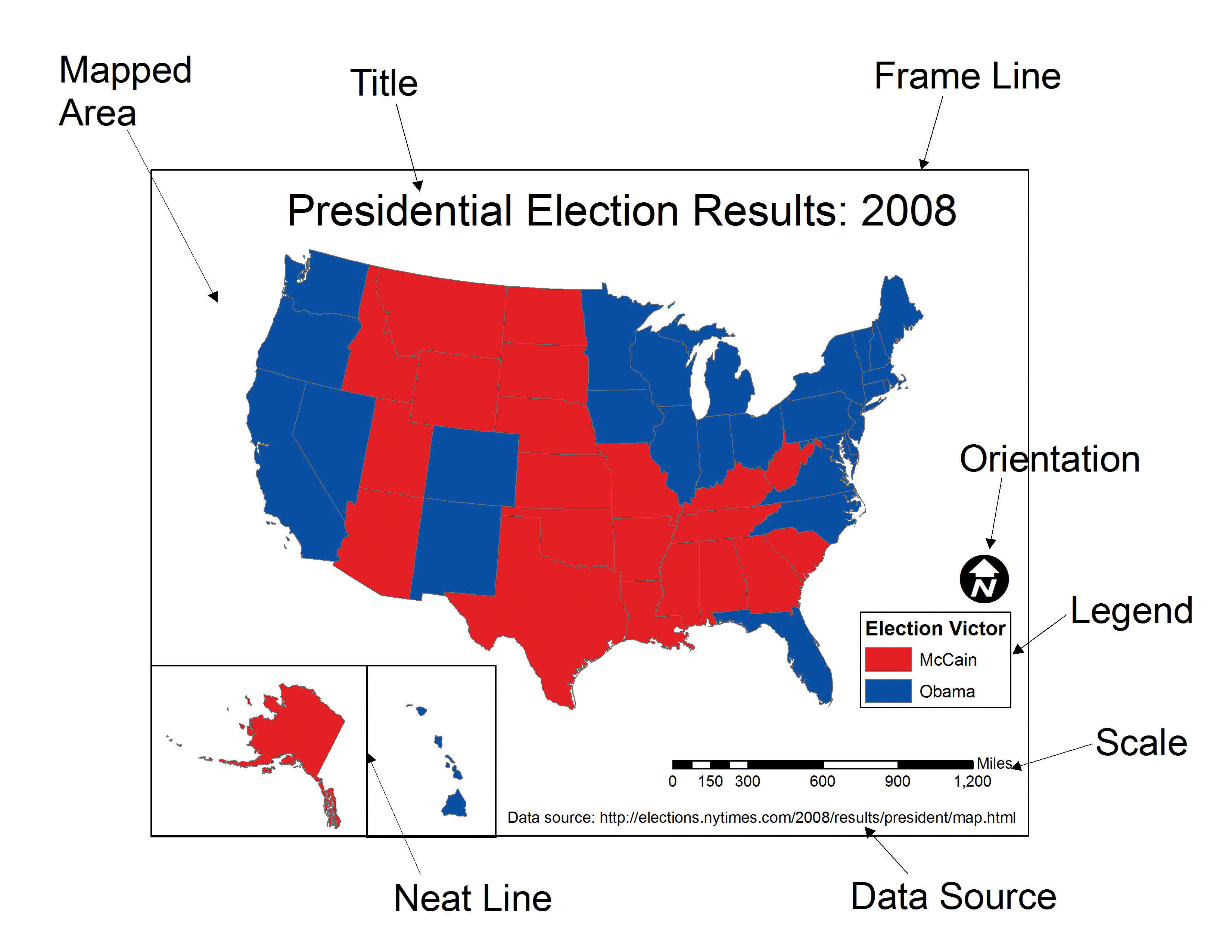
An annotated diagram showing all essential map
elements including title, legend, scale bar, north arrow, and source
citation.
Figure 2
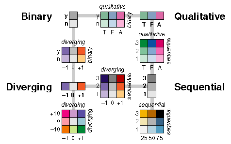
Examples of sequential, diverging, and
categorical color palettes.
Figure 3
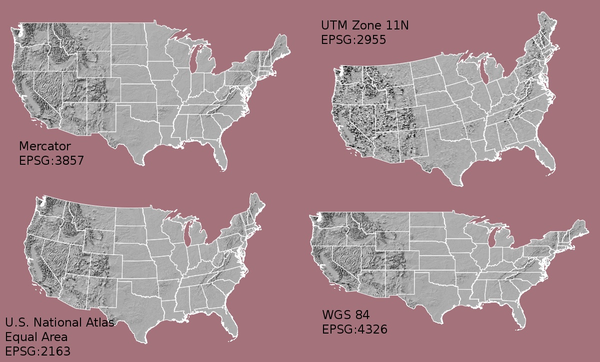
Examples of different map projections.
Figure 4
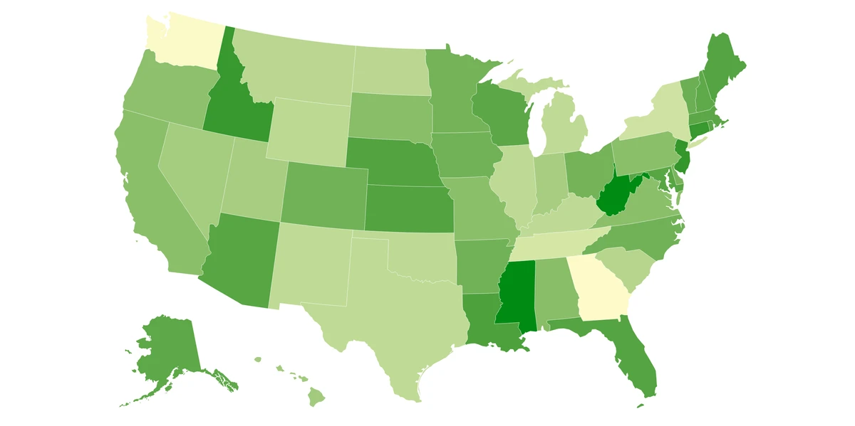
A choropleth map of U.S. states in varying
shades of green.
Figure 5
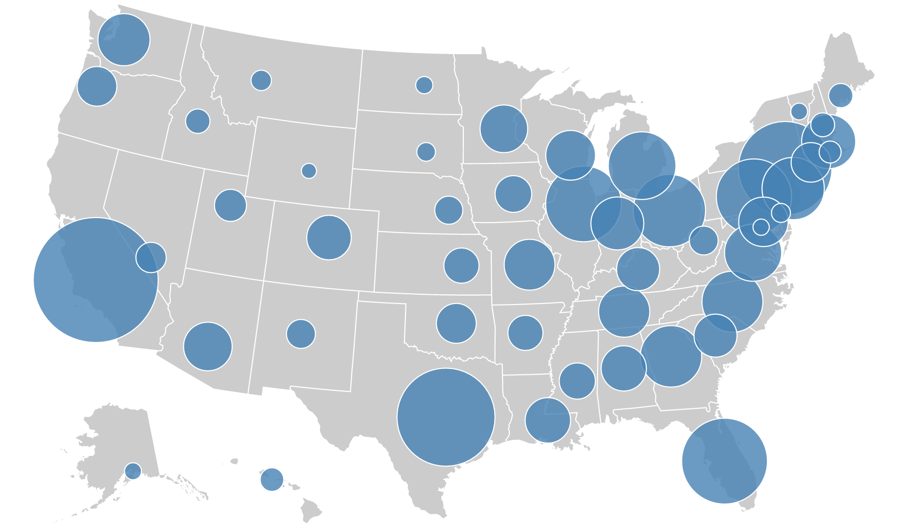
A proportional symbol map of the USA with
circles sized by population.
Figure 6
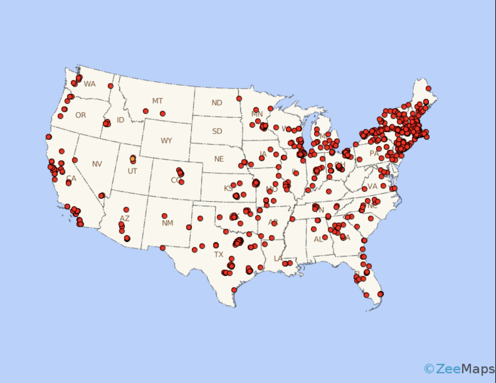
A dot density map of the USA.
Figure 7
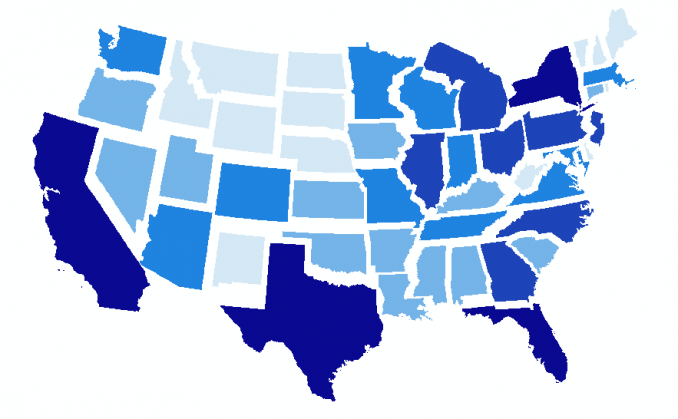
A non-contiguous cartogram of U.S. states
resized by a data value.
Figure 8
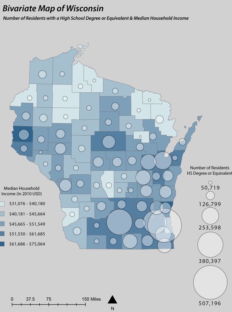
A multivariate map combining choropleth shading
and dot density.
Figure 9
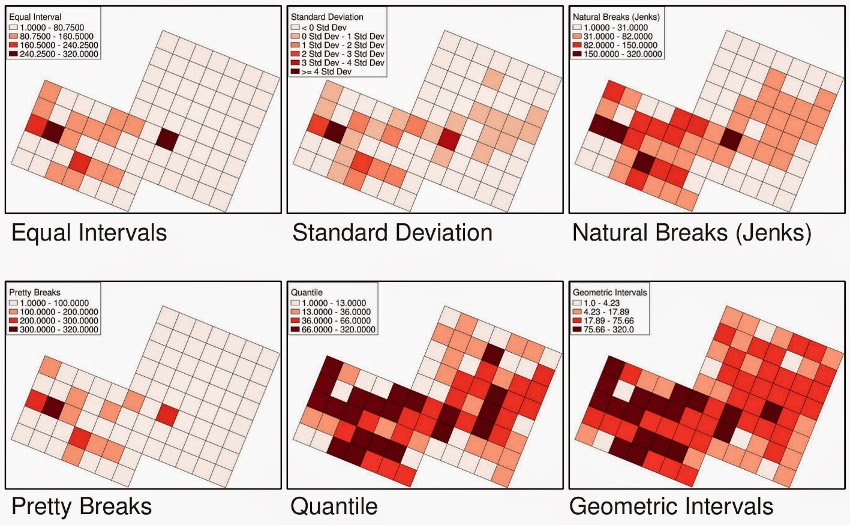
The same dataset classified using four different
methods.