
All in One View
Content from Case Study: Food Deserts
Last updated on 2026-10-17 | Edit this page
Estimated time: 105 minutes
Overview
Questions
- What is a food desert, and how does the USDA formally define one?
- Where can we find data on food deserts in the U.S., and how has that data changed?
- How can you visualize and reproduce the food desert analysis for your region of interest?
Objectives
- Explain the concept and history of food deserts and the USDA’s Low Income, Low Access (LILA) framework
- Provide an overview of the Food Access Research Atlas data from the USDA
- Visualize official food desert designations for any U.S. state (Beginner notebook)
- Reproduce the USDA methodology from raw open data and validate it against the official Atlas (Expert notebook)
What is a Food Desert?
A food desert is an area where residents have limited access to affordable and nutritious food, most often because they live far from a supermarket and lack the income or transportation to overcome that distance. The term is thought to have originated in Scotland in the early 1990s, where it described public housing estates left without grocery stores, and it entered mainstream U.S. policy during the 2000s as researchers connected neighborhood food environments to diet quality and health outcomes.
Distance alone does not make a food desert. A wealthy suburb ten miles from a supermarket is not one, because its residents can drive there without difficulty. Food deserts emerge from the combination of two conditions:
- Low income: many residents cannot afford to travel far for groceries or to pay higher prices at small convenience stores.
- Low access: the nearest supermarket, supercenter, or large grocery store is far away by neighborhood standards.
This pairing is why the USDA’s formal term is LILA: Low Income, Low Access. Throughout this lesson “food desert” and “LILA tract” mean the same thing.
How the USDA Measures It
In the 2008 Farm Bill, Congress directed the USDA to study food access nationwide. The USDA’s Economic Research Service (ERS) released the Food Desert Locator in 2011, which became the Food Access Research Atlas in 2013. The Atlas was updated with data for 2015 (released in 2017) and 2019 (released in 2021). In July 2026 the ERS renamed that atlas the Large Retailer Access Map and added a second map built on newer data (see “The 2026 update” below). The rest of this section describes the original method, which is the one the notebooks in this lesson use.
The Atlas works at the level of the census tract, a statistical neighborhood of roughly 4,000 people. Each tract is evaluated on both conditions:
Low income follows the Treasury Department’s New Markets Tax Credit rule. A tract qualifies if its poverty rate is at least 20 percent, or its median family income is at or below 80 percent of the statewide median, or, for tracts inside a metropolitan area, at or below 80 percent of the metro area median.
Low access is measured by distance to the nearest supermarket, supercenter or large grocery store. Convenience stores, dollar stores, drug stores and warehouse clubs do not count, because they rarely stock a full range of fresh food. The USDA overlays the country with a grid of half kilometer cells, estimates the population of each cell, and measures the straight line distance from each cell to the nearest store. A tract is low access if at least 500 people, or at least a third of the population, live beyond a distance threshold. Because “far” means something different in a city than in the countryside, the threshold depends on whether the tract is urban or rural. The Atlas publishes several combinations rather than one official answer:
| Measure | Urban threshold | Rural threshold |
|---|---|---|
| Standard | 1 mile | 10 miles |
| Strict urban | half a mile | 10 miles |
| Strict rural | 1 mile | 20 miles |
| Vehicle based | at least 100 households with no vehicle live more than half a mile away | at least 500 people, or a third of residents, live more than 20 miles away |
The vehicle measure captures an important nuance: a mile is trivial by car and a serious barrier on foot with grocery bags, so households without vehicles face low access at much shorter distances.
These definitions have limitations worth keeping in mind. Straight line distance ignores rivers, highways, and transit routes (the grocery access case study in this module shows how much longer real routes can be). The store list counts supermarkets but says nothing about prices or food quality, and some researchers argue the bigger problem in many neighborhoods is a “food swamp”, an abundance of fast food and convenience stores rather than an absence of anything. Treating the Atlas as a starting point for questions, not a final verdict, is good practice.
The 2026 update: two maps
In July 2026 the ERS reorganized the Food Access Research Atlas into two maps:
| Large Retailer Access Map (LRAM) | SNAP-Authorized Retailer Access Map (SRAM) | |
|---|---|---|
| What it is | The original Atlas, renamed | A new map, first released in July 2026 |
| Stores counted | Supermarkets, supercenters and large grocery stores | All brick-and-mortar stores authorized to accept SNAP benefits (excluding farmers markets and delivery routes) |
| Store data | 2019 | 2025 |
| Census tracts | 2010 boundaries | 2020 boundaries |
| Distance | Straight line | Straight line, plus driving distance along the road network |
| Next update | Expected winter 2026 to 2027 | Updated as needed |
Because the SRAM counts every SNAP-authorized store, including many smaller shops, it answers a different question from the LRAM: access to any store that accepts SNAP, rather than access to a large, full-service store. The two maps are not directly comparable, so always say which one you use. The notebooks in this lesson use the 2019 LRAM data, which is still the ERS’s measure of access to large food retailers.
The Data We Work With
TIGER Shapefiles
A TIGER/Line shapefile (Topologically Integrated Geographic Encoding
and Referencing) is the Census Bureau’s free digital format for
geographic boundaries such as roads, rivers, and administrative areas.
We use the census tract boundary files, published per state. A shapefile
is a bundle: the .shp holds the geometry, the
.dbf holds the attribute table, and the .shx
links the two, so all three must stay together. Conveniently, geopandas
can read the whole zipped bundle directly from the Census Bureau’s URL,
so nothing has to be downloaded by hand.
The Food Access Research Atlas
The Atlas is a single Excel file covering every census tract in the country. It contains three sheets: a Read Me with citation information, a Variable Lookup that serves as the metadata dictionary explaining every column, and the data sheet itself. The LILA columns contain only 0s and 1s, where 1 means the tract qualifies under that measure. The file describes the entire country, so the first step of any analysis is filtering to a state or county of interest, which also keeps maps readable.
Learning Pathway: From Viewing the Atlas to Rebuilding It
This lesson is built around two notebooks that form a deliberate progression.
The
Beginner
notebook works with the USDA’s published answers. You read
a state’s tract boundaries straight from the Census Bureau, read the
Atlas straight from the USDA, join the two tables on the tract
identifier (GEOID on the Census side,
CensusTract on the USDA side, both converted to strings
before merging), and map the four LILA measures side by side. You will
see how the picture of food access shifts as the definition tightens or
loosens, and how to zoom in on a single county, using Marion County,
Indiana as the example. Everything is parameterized by the state FIPS
code, so the same notebook runs for any state.
Working with the published Atlas has two limits, and they motivate the second notebook. First, the Atlas is a finished product: you cannot ask it what happens with a different store list, a different threshold, or a different year. Second, its large-retailer data still describes 2019, and the food landscape has changed since then.
The Expert notebook therefore rebuilds the entire analysis from raw ingredients. Income, poverty, population, and vehicle data come from the Census API, so you need your own free Census API key (see Setup). Supermarket locations come from OpenStreetMap, pinned to a chosen date so the store data matches the analysis year. The notebook constructs the same half kilometer grid the USDA uses, allocates population to it, computes distances, and applies the LILA rules exactly as defined above. Crucially, it then validates itself: it reads the official 2019 Atlas and reports, tract by tract, how closely the open data reproduction matches the USDA’s own result, which relies on a commercial store list that is not public. Once validated, the same pipeline can compute food access for years the USDA never published, turning a static 2019 snapshot into an instrument for studying change over time.
Complete the Beginner notebook first. The concepts it introduces, tracts, joins, LILA flags, and choropleth maps, are exactly the vocabulary the Expert notebook builds on.
Which definition?
A city council asks you to map food deserts so it can decide where to fund a new grocery store. Many residents of one neighborhood are older adults without cars, and the nearest supermarket is 0.8 miles away. Which LILA measure would flag this neighborhood, and which would miss it?
The standard measure (1 mile in urban areas) would miss it, because 0.8 miles is under the threshold. The strict urban measure (half a mile) would flag it if enough residents live beyond half a mile. The vehicle based measure would flag it if at least 100 households without a vehicle live more than half a mile from the store. The choice of measure is a policy decision as much as a technical one, which is why the Atlas publishes several.
Explore your own state
Run the Beginner notebook for your home state (or Indiana) by changing the state FIPS code. Which of the four LILA measures flags the most tracts, and which the fewest? Why?
Some answers follow from the definitions. The strict urban measure (half a mile and 10 miles) can never flag fewer tracts than the standard measure (1 mile and 10 miles), because its urban bar for “far” is lower, and in most states it flags the most. The strict rural measure (1 mile and 20 miles) can never flag more tracts than the standard one, because its rural bar is higher. The vehicle based measure follows its own logic, so compare it on the map: it tends to pick out city neighborhoods where many households have no car.
What Can This Analysis Be Used For?
- Public policy: identifying tracts that qualify for healthy food financing programs and evaluating whether interventions changed access over time.
- Site selection: retailers and food banks can locate the underserved areas where a new store or distribution point would matter most.
- Transportation planning: overlaying LILA tracts with transit networks reveals where bus routes could connect residents to existing stores.
- Research: joining food access with health, environment, or demographic data supports studies of diet, equity, and urban form.
- A food desert combines two conditions: low income and low physical access to supermarkets, which the USDA formalizes as LILA tracts
- The Food Access Research Atlas publishes several distance based measures rather than one official definition, and the choice of measure changes the map
- The Atlas data supports policy analysis, site selection for new grocery stores, and spatial analysis of transportation networks
- In July 2026 the Atlas became two maps: the Large Retailer Access Map (2019 data) and the new SNAP-Authorized Retailer Access Map (2025 data, with driving distances); they measure different things
- The Beginner notebook visualizes the published 2019 Atlas for any state; the Expert notebook reproduces the methodology from open data, validates it against the Atlas, and extends it to other years
Content from Grocery Access Part 1: Mapping Stores with QField
Last updated on 2026-10-17 | Edit this page
Estimated time: 45 minutes
Overview
Questions
- What does a QField data collection project look like from start to finish?
- What should we record at each grocery store to support a later food access analysis?
- How do we keep field data consistent and ready for quality checks?
Objectives
- Follow an end-to-end field workflow, using grocery stores in Lafayette and West Lafayette as the example
- Explain the reasons behind point placement, attribute choices and GPS accuracy rules
- Recognize what good field data looks like before collecting it yourself
About this case study
The food desert case study used the USDA’s published measures, which rely on lists of large stores and on straight-line distance. This case study looks at grocery access in one place from the ground up, in two parts:
- Part 1 (this episode): how a team would build and check its own dataset of grocery stores in the field with QField, a demonstration
- Part 2: a network analysis in QGIS that measures how far people must travel along roads to reach a supermarket
It brings together skills from the Data Collection module (field data and census data) and applies them to one question.
Scenario
Imagine you are on a community research team in Lafayette and West Lafayette, Indiana. Your goal is to understand where access to groceries may be limited, so that you can later map potential food deserts using demographic data and travel distances along the road network.
Before you can analyze food access, you need a clean, consistent dataset of grocery store locations and basic access information. Public sources help: OpenStreetMap, for example, lists more than 60 food stores in the two cities. But they cannot tell you whether a store sells fresh produce or accepts SNAP benefits, and some entries may be out of date. This episode demonstrates how a team would check and complete that dataset with QField in the field and QGIS on a computer.
This is a demonstration
You do not need to install anything or follow along on a phone. The goal is to understand the workflow and what good field data looks like. If you want to try QField yourself, see the box at the end of this episode.
What the mapper collects
- One point per grocery store, placed at the main public entrance
- A standard set of attributes, chosen from dropdown lists
- A photo of the storefront sign
- A short note about anything unusual
The result is a dataset ready for a food access analysis, such as the network analysis in the next episode.
Project setup
Before anyone goes out, the project leader prepares a project in QGIS that includes:
- An offline basemap, so the map works without mobile data
- The study area boundary for Lafayette and West Lafayette
- An editable point layer called Grocery Stores, starting from the stores already listed in OpenStreetMap
- A prebuilt data entry form with dropdown lists
The project is then packaged for QField with the QFieldSync plugin in QGIS, and copied to each phone, either by cable or through QFieldCloud, QField’s optional online syncing service.
Why prepare the form in advance?
Field collection fails when every person invents their own fields and categories. A prepared form keeps the dataset clean and ready to analyze.
The data schema (what gets collected, and why)
| Field | Type | Why |
|---|---|---|
store_name |
Text | Needed to identify stores and find duplicates |
store_type |
Dropdown | Compare supermarkets with convenience stores and other types |
address |
Text | Match the store to other datasets and verify its location |
city |
Dropdown | Filter and report by city |
zip |
Text | Summarize by ZIP code area |
snap_accepted |
Yes / No / Unknown | Access for people using SNAP benefits |
wic_accepted |
Yes / No / Unknown | An additional access signal |
produce_available |
Yes / No / Unknown | A simple measure of healthy food availability |
hours_observed |
Text | Hours matter for access, for example for night-shift workers |
verification |
Dropdown | Whether the record was checked in the field, and when |
notes |
Text | Keeps context without inventing new fields |
photo_1 |
Attachment | Evidence for later checking |
Why dropdowns matter
If one person writes “EBT”, another writes “SNAP” and another writes “Yes”, the later analysis becomes messy. Dropdowns prevent this kind of category drift.
Part 1: Opening the project and checking it is ready
The mapper opens QField and runs a quick check:
- The basemap displays.
- The study area boundary loads.
- The Grocery Stores layer is visible and can be edited.
This is the most common point of failure: missing layers, broken file paths or read-only layers are often discovered only after arriving at the first store.
Part 2: The GPS rule
The mapper waits for the GPS accuracy to settle, then applies a rule:
- Preferred: record a point when the accuracy is better than 10 meters
-
If that is not possible: record it anyway and
describe the problem in
notes
A store point that is 30 to 50 meters off can change whether it falls inside a service area or which road it is assigned to, especially near boundaries.
Part 3: Recording a store
Example A: a full-service supermarket
What the mapper does:
- Stands at the main public entrance (the placement rule).
- If the store is already on the map, opens that point instead of creating a new one. Otherwise, creates one point for the store.
- Fills in the form:
-
store_name: as shown on the sign -
store_type: Supermarket -
snap_accepted: Yes (based on a posted sign) -
wic_accepted: Unknown (no sign visible) -
produce_available: Yes (produce section visible) -
hours_observed: copied from the door -
verification: Field verified, with the date
-
- Takes a storefront photo showing the store’s name and, if visible, its posted hours.
Why the entrance? Entrances are consistent and repeatable, and they are what matters for walking distance. The center of a large building, or its parking lot, is much less meaningful for access.
Example B: a small market or convenience store
What changes in the form:
-
store_typemight be Convenience or Small market -
produce_availablemight be Unknown or No, depending on what is visible - The mapper does not assume SNAP or WIC without evidence
“Unknown” is better than a guess. Guessing introduces systematic bias into the dataset.
Part 4: Common problems
| Situation | What the mapper does | Why |
|---|---|---|
| A point with the same store name is already nearby | Edits the existing point instead of adding a new one | Duplicates inflate store counts and distort access |
| GPS accuracy is worse than 10 m | Records the point anyway and notes it, for example “GPS about 22 m; placed at main entrance” | Being open about error is better than false precision |
| The store is closed or being renovated | Records it, notes “Closed during visit”, and leaves uncertain fields as Unknown | Whether a store is open affects real access |
| The store is not in the starting data | Adds a new point | Public datasets miss stores, especially small ones |
| A store on the map no longer exists | Sets verification to “Not found” rather than deleting
it |
Keeps a record of what was checked |
Part 5: Sync and check in QGIS
Back at the computer, the mapper syncs the project and opens it in QGIS to check:
- Completeness: are the required fields filled in?
- Location: do points fall inside the study area, and none in impossible places?
- Duplicates: any points with the same name very close together?
- Photos: do they open, and do they match their records?
Checking right away means you still remember what you saw. Waiting weeks turns fixable problems into permanent uncertainty.
What good output looks like
At the end of the demonstration, the dataset has:
- One record per store, with no duplicates
- Consistent categories, controlled by dropdowns
- “Unknown” used where appropriate, instead of guesses
- Photos that support checking
- Notes that capture exceptions without creating new categories
- A record of which stores were verified, and when
This is the foundation you need before any food desert mapping begins.
Look at the starting data
The grocery stores used in the next episode came from OpenStreetMap. Open the file in QGIS (Layer > Add Layer > Add Vector Layer, Protocol: HTTP(S), cloud, etc.) with this address:
https://raw.githubusercontent.com/SpatialTurn/CaseStudies/main/data/grocery_stores.geojson
Open its attribute table. Which fields from the schema above are present, and which would a field visit need to add?
The file has store_name, store_type,
address, city, osm_id,
source and verification. Every record says
“Not field verified”, and some have no address or no name. A field visit
would add snap_accepted, wic_accepted,
produce_available, hours_observed,
notes and photos, fill in missing names and addresses, and
update verification.
Want to try QField yourself?
- Install QField on your phone from https://qfield.org/ (Android, iOS) or on a computer.
- In QGIS, install the QFieldSync plugin (Plugins > Manage and Install Plugins).
- Build a small project with one editable point layer, set dropdowns in Layer Properties > Attributes Form (choose the Value Map widget), and package it with QFieldSync.
- Copy the package to your phone, or use QFieldCloud, and map a few places around you.
The QField documentation walks through each step.
Next
In Part 2, we use grocery store points like these, together with the road network, to measure how far people must travel to reach a supermarket.
- A clear scenario and a consistent schema make field data analyzable
- Prepare the project and form in QGIS before going out, and package it with QFieldSync
- Place points by a fixed rule, record GPS accuracy, and use “Unknown” instead of guessing
- Check the data in QGIS as soon as possible after collection
Content from Grocery Access Part 2: Network Analysis in QGIS
Last updated on 2026-10-17 | Edit this page
Estimated time: 75 minutes
Overview
Questions
- How do we move from grocery store points to an analysis of travel along roads?
- How do shortest path and service area tools in QGIS answer different questions about access?
- Why is network distance often better than straight-line distance for access studies?
Objectives
- Load grocery store, road and study area layers into QGIS from the web
- Reproject layers to a projected coordinate system so that distances are in meters
- Calculate shortest paths from one origin to every supermarket
- Generate service areas that show which streets are within walking distance of a supermarket
- Recognize data problems that break network analysis
Overview
In Part 1, a team mapped grocery stores in the field with QField. In this episode, we use grocery store points with a road network to ask a new question:
How accessible are grocery stores when movement is limited to the road network?
This episode moves from data collection to analysis. Instead of treating distance as a straight line, we measure routes along streets.
Imagine that a class, a community partner or a student group wants to know how easy it is to reach a supermarket from a residence hall, an apartment complex or a neighborhood. We will:
- prepare the grocery store and road data
- calculate routes from one starting point to every supermarket
- create service areas showing the streets within a chosen distance of a supermarket
The data
Three small files are stored in the data/ folder of this
lesson’s repository. You do not need to download them; QGIS reads them
straight from the web.
| Layer | Contents | Source |
|---|---|---|
grocery_stores |
64 food stores in and around Lafayette and West Lafayette: 17 supermarkets, 2 wholesale stores and 45 convenience stores | OpenStreetMap contributors (Open Database License), October 2026 |
roads |
3,466 road segments covering both cities and a margin around them | U.S. Census Bureau, TIGER/Line 2024 |
study_area |
The city limits of Lafayette and West Lafayette | U.S. Census Bureau, 2024 cartographic boundary files |
The store points stand in for data collected with QField. In a real project, the team would have verified them in the field first.
Before you begin
- QGIS installed (see Setup)
- Basic familiarity with the QGIS interface, for example from the Foundations module’s Getting Started with QGIS episode
Step 1: Load and inspect the layers
Open QGIS and start a new project.
Go to Layer > Add Layer > Add Vector Layer.
For Source Type, choose Protocol: HTTP(S), cloud, etc. and leave Type as HTTP/HTTPS/FTP.
-
Paste the first address into URI, click Add, and repeat for the other two:
https://raw.githubusercontent.com/SpatialTurn/CaseStudies/main/data/grocery_stores.geojson
https://raw.githubusercontent.com/SpatialTurn/CaseStudies/main/data/roads.geojson
https://raw.githubusercontent.com/SpatialTurn/CaseStudies/main/data/study_area.geojson
Click Close. In the Layers panel, drag
grocery_storesto the top so the points draw above the roads.Right-click
grocery_storesand choose Open Attribute Table. Look at the fields:store_name,store_type,address,city,osm_id,sourceandverification.
Before analyzing anything, look for problems:
- duplicate points
- stores outside the study area
- stores with no name or address
- roads that look disconnected from the rest
Quick inspection
Look at the map and the attribute table. What do you notice? Which kinds of data problems would most directly affect a network analysis?
You may notice that six convenience stores, such as a Love’s travel stop, lie just outside the city limits. Stores like these should usually stay in an analysis, because city residents shop there too. (All 17 supermarkets are inside the city limits.) A few convenience stores have no name, and several stores have no address. Two Fresh Thyme points might look like duplicates, but they are two different stores, one in each city; check before deleting anything.
The problems that most directly affect a network analysis are those that affect where a route starts or ends:
- a store point placed far from any road
- duplicate stores, which inflate the number of destinations
- disconnected road segments, which break routes
- layers in different coordinate systems, which appear in the wrong place
Step 2: Keep only the supermarkets
Convenience stores rarely sell a full range of fresh food, so food access studies usually focus on supermarkets.
- Open the Processing Toolbox (Processing > Toolbox).
- Search for Extract by attribute and open it.
- Set Input layer to
grocery_stores, Selection attribute tostore_type, Operator to=, and Value toSupermarket. - Click Run. A new layer called Extracted
(attribute) appears with 17 supermarkets. Rename it
supermarkets(right-click > Rename Layer).
Step 3: Reproject the data
Network analysis should be done in a projected coordinate system, so that distances are measured in meters rather than degrees. The files are stored in latitude and longitude (EPSG:4326). For Lafayette, a good choice is NAD83 / UTM zone 16N (EPSG:26916).
- In the Processing Toolbox, search for Reproject layer and open it.
- Set Input layer to
supermarketsand Target CRS to EPSG:26916. - Click Run, and rename the output
supermarkets_utm. - Repeat for
roads(rename the outputroads_utm) andstudy_area(study_area_utm). - Set the project coordinate system too: click the CRS button in the bottom-right corner of the QGIS window (it shows something like EPSG:4326), search for 26916, select NAD83 / UTM zone 16N, and click OK.
Why set the project CRS as well?
QGIS’s network tools report travel cost in the units of the project’s coordinate system. If the project is still in EPSG:4326, a 4 km route is reported as a cost of about 0.036 (degrees). With the project in EPSG:26916, the same route has a cost of about 4,000 (meters).
Do not assume that layers are ready for analysis just because they draw in the same place. Check the CRS of each layer (right-click > Properties > Information).
Step 4: Do not clip the roads too tightly
It is tempting to clip the road layer to the city limits to make it smaller. Here, that is a mistake. The road file already stops a short distance outside the two cities, and the city limits are irregular: they do not even meet each other across the Wabash River. Clipping the roads to them removes the bridges and splits the network into pieces.
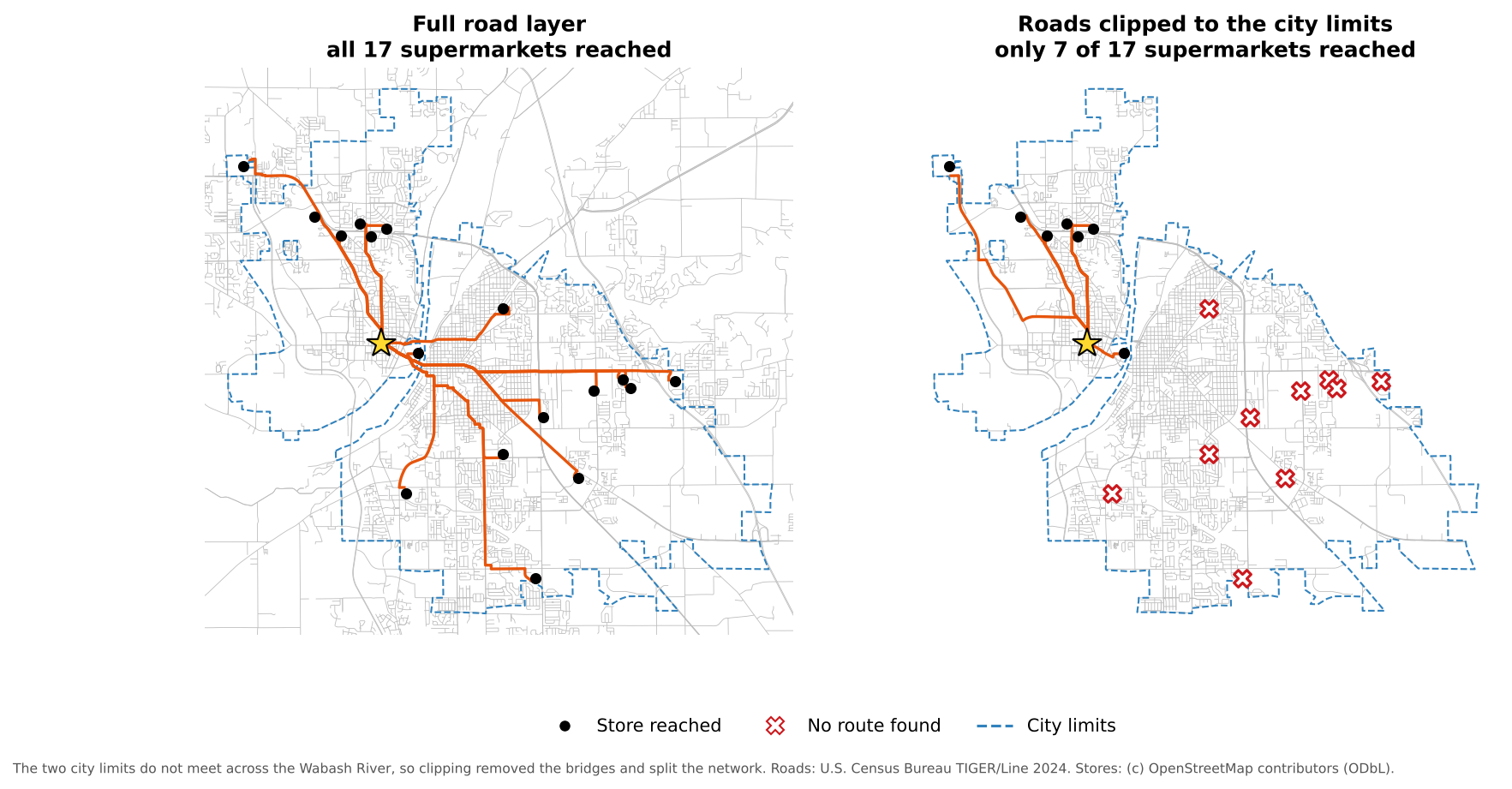
With the full road layer, all 17 supermarkets can be reached. With roads clipped to the city limits, only 7 can. When you do clip a network, clip it to a generous rectangle or buffer around your study area, never to an irregular boundary.
Step 5: Choose a starting point
Our origin is the Purdue Memorial Union, in the center of campus. You will set it inside the shortest path tool in the next step, either by clicking on the map or by typing its coordinates:
507575, 4474900 [EPSG:26916]Why start with one origin?
Why might it be better to start with a single origin before moving on to many homes or neighborhoods?
A single origin keeps the first analysis easy to read. You can inspect the routes, compare stores and find problems with snapping or connectivity before moving to a more complex workflow with many origins.
Step 6: Shortest paths to every supermarket
- In the Processing Toolbox, search for Shortest path (point to layer) and open it.
- Set the parameters:
-
Vector layer representing network:
roads_utm - Path type to calculate: Shortest
- Start point (x, y): click the … button, then click the Purdue Memorial Union on the map, or paste the coordinates from Step 5
-
Vector layer with end points:
supermarkets_utm - Shortest path: leave as a temporary layer
- Non-routable features: leave as a temporary layer
-
Vector layer representing network:
- Click Run.
You now have a line layer, Shortest path, with one
route from the origin to each supermarket. Its cost field
is the route length in meters.
When a store cannot be reached
If a store cannot be reached through the network, its route has an empty (NULL) cost. Stores that cannot be connected to the network at all are listed in the Non-routable features layer. Both usually point to a data problem: a store far from any road, a gap in the network, or a network clipped too tightly.
Step 7: Compare network and straight-line distance
- Style the Shortest path layer with a bold, bright line, the supermarkets with a distinct point symbol, and the roads in light gray.
- Open the attribute table of Shortest path and click the Field Calculator button (the abacus icon).
- Create a new field
route_km(Decimal number) with the expression"cost" / 1000. - Create another field
straight_kmwith the expressiondistance(start_point($geometry), end_point($geometry)) / 1000. This is the straight-line distance between the two ends of the route. - Create a third field
detourwith the expression"route_km" / "straight_km". - Close the Field Calculator, turn off editing (save the edits), and
sort the table by
route_km.
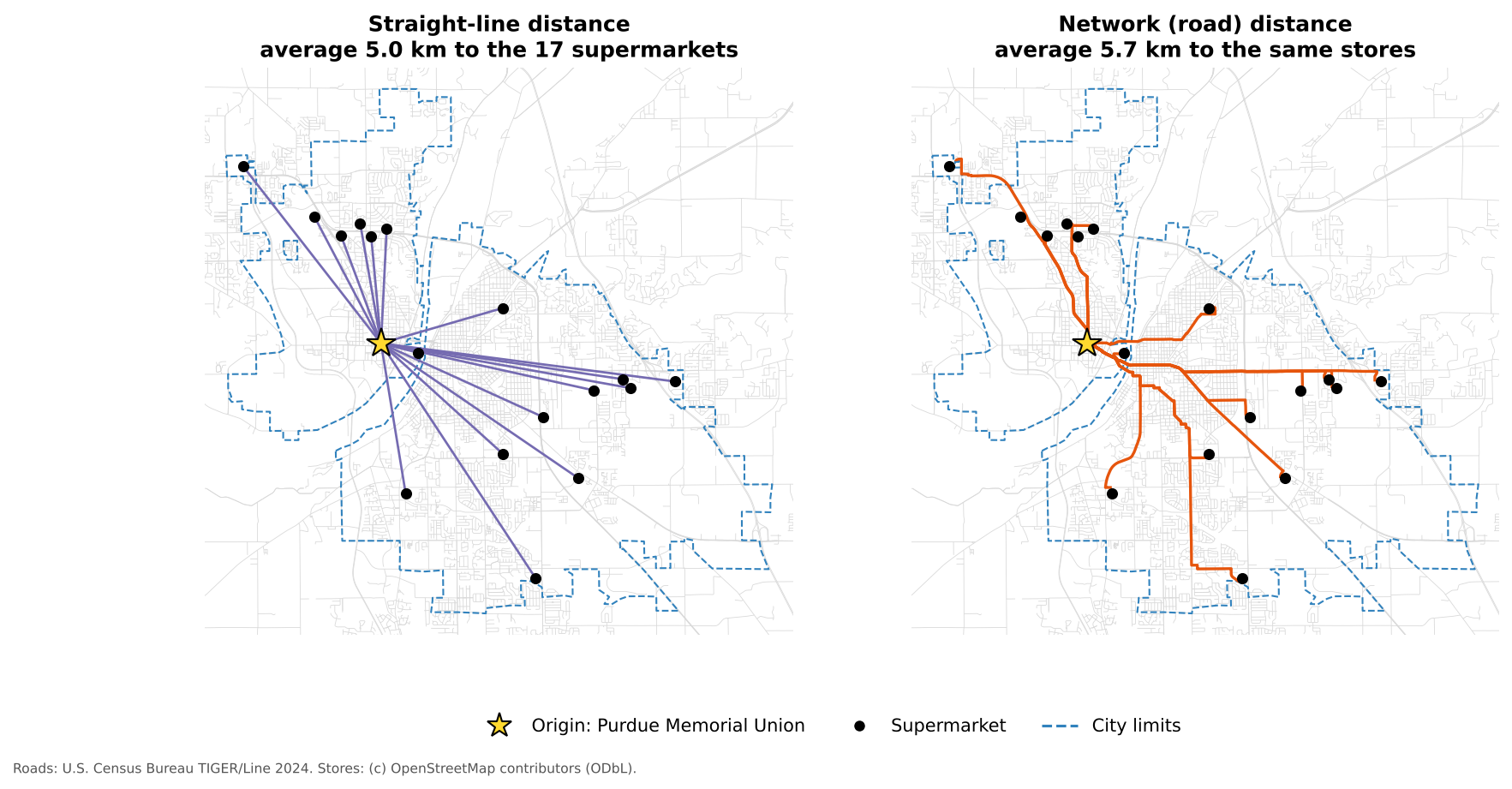
The nearest supermarket by road is about 1.3 km away. On average, routes are about 14% longer than straight lines, and some are much longer: the Walmart Supercenter on Veterans Memorial Parkway is 8.0 km away in a straight line but about 10.1 km by road, a detour of about 1.3. The river, the few bridges, railroads and cul-de-sacs all force detours.
Interpreting route results
A store looks close on the map, but its route is much longer than expected. Name two possible reasons.
- The street network requires a detour, for example because there is no bridge or direct road
- The store or the origin snapped to a different road segment than you expected
- Barriers such as rivers, railroads, highways with few crossings, or cul-de-sacs
- The store point is slightly off its true entrance, for example in the middle of a large parking lot
Step 8: Service areas around supermarkets
Shortest paths answer the question: how do I get from one place to each store?
Service areas answer a different question: which streets are within a given distance of a store?
- In the Processing Toolbox, search for Service area (from layer) and open it.
- Set the parameters:
-
Vector layer representing network:
roads_utm -
Vector layer with start points:
supermarkets_utm - Path type to calculate: Shortest
-
Travel cost:
800(meters, about a 10-minute walk)
-
Vector layer representing network:
- Click Run.
The output, Service area (lines), shows the parts of the street network you can reach within 800 m of a supermarket.
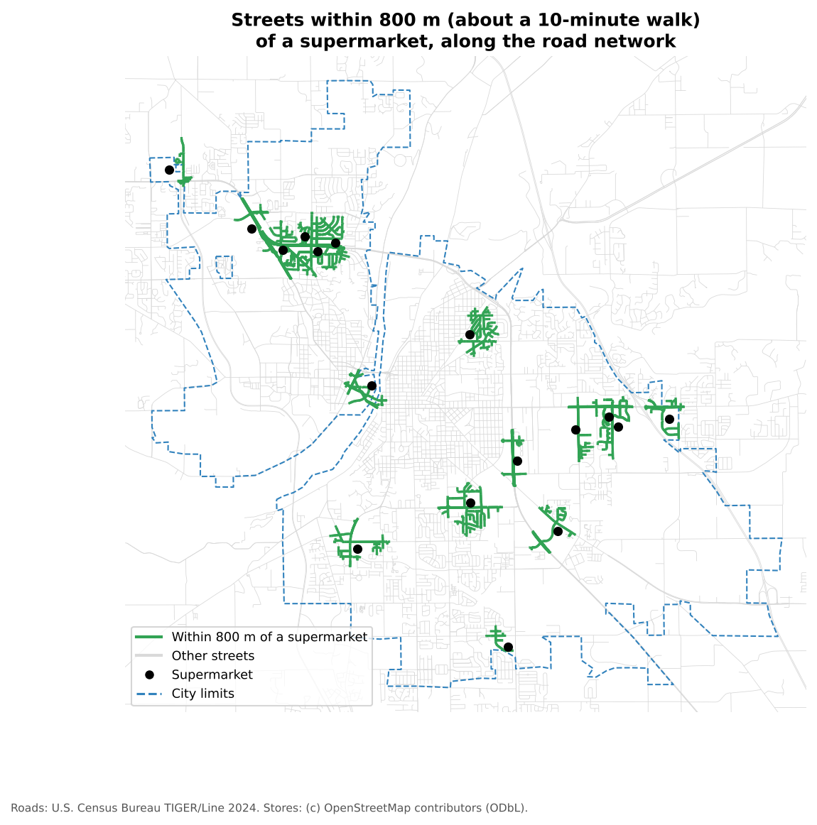
Only about 11% of the street length inside the two cities is within an 800 m walk of a supermarket. Most supermarkets sit on commercial corridors at the edges of the cities, designed for people who drive.
Step 9: Interpret the results
Service areas support questions such as:
- Which parts of the study area appear well served by the current supermarkets?
- Which neighborhoods appear poorly connected?
- How does the answer change with a travel cost of 400 m, 800 m or 1,600 m?
Combine this with the census map of households without a car, made in notebook 1c of the Data Collection module’s Census episode:
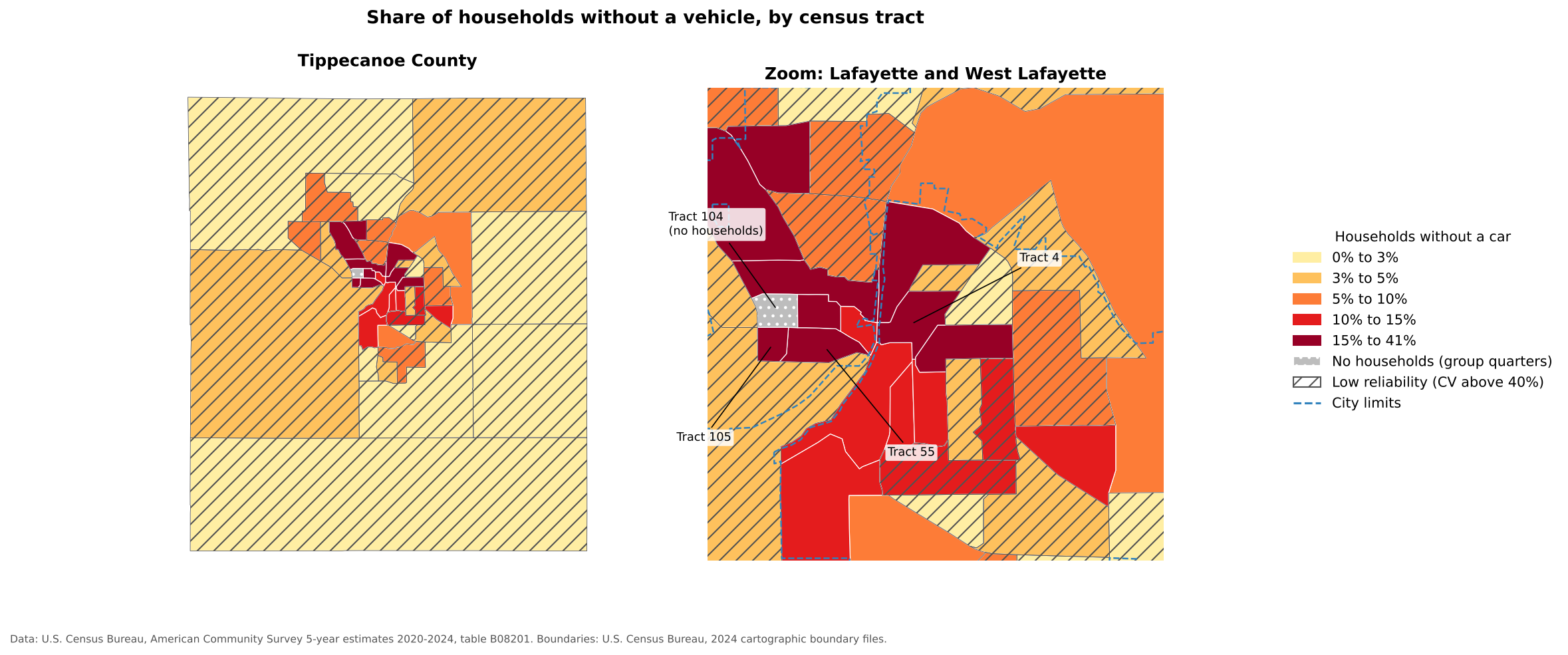
Of the six census tracts with the highest share of households without a car, four (tracts 4, 7, 105 and 112, in central Lafayette and around the Purdue campus) have almost no streets within 800 m of a supermarket. That is exactly where a food access problem would be expected.
Remember that the result is only as good as the network and the assumptions behind it:
- A road centerline layer does not show sidewalks, crosswalks or footpaths
- Highways appear walkable in the network, but are not
- Verified store points improve the destinations, but cannot fix a poor road layer
Reflection
What parts of real-world access are still missing from this analysis, even after using a network instead of straight-line distance?
Possible answers include sidewalk quality, crosswalks, traffic safety, bus routes, store hours, prices, food quality, disability access, and whether a road is really walkable.
Change the distance
Run Service area (from layer) again with a travel
cost of 1600 (about a 20-minute walk). How does the picture
change?
The share of city streets within reach rises from about 11% to about 40%, and the green areas begin to join along the main corridors. But some areas are still left out: tract 105, beside the Purdue campus, where more than 40% of households have no car, has no streets within 1,600 m of a supermarket along the network. Walking 20 minutes each way with groceries is a real burden, which is why access studies also consider car ownership and public transit.
Step 10: Save your outputs
Temporary layers disappear when QGIS closes. To keep them,
right-click each one and choose Export > Save Features
As…, and save it to a GeoPackage (for example
grocery_access.gpkg) with a different Layer
name for each:
supermarkets_utmroads_utmshortest_pathsservice_area_800m
Then save the project (Project > Save). These outputs can be reused to join service areas to census data, to design a map layout, or to compare neighborhoods.
Suggested pacing: loading and inspection 10 minutes; extracting and reprojecting 15; shortest paths 15; comparing distances 10; service areas 15; discussion and challenges 15.
Teaching strategy: keep the lesson focused on one idea: network distance differs from straight-line distance. Connect it to the Data Collection census map of households without a car (shown in Step 9).
Common learner problems:
- the project CRS is left in EPSG:4326, so costs appear in degrees
- layers are not reprojected consistently
- the road network is clipped too tightly (show the clipping figure)
- learners confuse service areas with buffers (a buffer ignores roads)
- outputs are left as temporary layers and lost
Extensions: compare shortest and fastest paths; build a layer of several origins (residence halls or apartment complexes); convert service area lines to polygons with the Concave hull tool; join service areas to census tracts.
- Grocery store points become far more useful for access questions when combined with a road network
- Reproject layers and set the project CRS to a projected system so that costs are in meters
- Shortest path tools compare routes; service area tools show which streets are within reach
- Network distance is longer than straight-line distance, sometimes by much more than expected
- Clipping a network to an irregular boundary can break routes; check for unreachable destinations