
All in One View
Content from Introduction to Foundations
Last updated on 2026-10-17 | Edit this page
Estimated time: 30 minutes
Overview
Questions
- What do I need to know before starting the other modules?
- Which tools does this curriculum use, and what is each one for?
- How do Google Colab notebooks work?
Objectives
- Describe what Python, Jupyter notebooks, Google Colab and QGIS are used for
- Open a notebook in Colab, save your own copy and run its cells
- Choose the right tool for a simple geospatial task
- Find your way through the modules of the curriculum
Why a foundations module?
The other modules in this curriculum assume a little background: how to run a Python notebook, what a table and a map layer are, and how to load data into QGIS. This module teaches exactly that, from zero. If you have never written code or opened a GIS, start here. If you already know some Python or QGIS, skim the episodes and use the notebooks as a refresher.
The tools
| Tool | What it is | What we use it for |
|---|---|---|
| Python | A free, general-purpose programming language with excellent libraries for data and maps | Reading, cleaning, analyzing and mapping data in a repeatable way |
| Jupyter notebook | A document that mixes text, code and results | Every Python lesson in the curriculum |
| Google Colab | A free service that runs Jupyter notebooks in your web browser | Running the notebooks without installing anything |
| QGIS | A free, open source desktop GIS | Looking at data, styling layers and making finished maps |
Python and QGIS are not rivals. Many projects use both: Python to download and prepare data, and QGIS to check it visually and design the final map. Both read the same file formats (GeoJSON, GeoPackage, shapefile, GeoTIFF).
Working in Google Colab
Every notebook link in this curriculum opens in Colab. The first time:
- Make sure you are signed in to a Google account.
- Click the notebook link. It opens read-only, straight from GitHub.
- Choose File > Save a copy in Drive. Your copy keeps your changes; the original stays clean.
- Run cells from top to bottom: click a cell and press Shift + Enter.
- If Colab warns that the notebook was not written by Google, click Run anyway.
A few things to know:
-
Order matters. Later cells use variables made in
earlier cells. If you skip a cell, you will see a
NameError. Use Runtime > Run before to catch up. - Sessions end. After a while without activity, Colab disconnects and forgets everything in memory. Reconnect and rerun the cells from the top.
- Files are temporary. Files you create appear in the Files panel on the left and disappear when the session ends. Download anything you want to keep.
- Data comes from the web. All notebooks read their data straight from a web address, so you never need to download data by hand.
Do I need to install Python?
No. Colab runs Python on Google’s computers and already includes the libraries used in this curriculum (pandas, matplotlib, GeoPandas). If you prefer to work on your own computer, the Setup page explains how to install Python with Anaconda.
What this module covers
| Episode | You will learn | Notebooks |
|---|---|---|
| Python Basics | Running cells, variables, text, lists, dictionaries, decisions, loops and functions | 2a to 2f |
| Working with Data | Tables with pandas and charts with matplotlib | 3a and 3b |
| Geospatial Python Basics | Map layers with GeoPandas, coordinate reference systems, and joining data | 4a to 4c |
| Getting Started with QGIS | Loading data from the web, styling layers and making a finished map layout | none (QGIS) |
Where to go next
After this module, the curriculum follows the life of a research dataset:
- Data Management: data models, formats, coordinate systems and planning
- Data Collection: repositories, census data, geocoding, imagery and field data
- Data Analysis: network analysis, spatial autocorrelation, clustering and NDVI
- Data Visualization: charts, map design and accessibility
- Data Curation: metadata, documentation, preservation and sharing
- Case Studies: food deserts and grocery access, from start to finish
Which tool?
Would you reach for Python (in Colab), QGIS, or both?
- Download median income for every county in the United States and calculate a new column
- Design a printed poster map of a city’s parks with a legend and scale bar
- Check whether a layer someone sent you lines up with the roads
- Repeat the same analysis every month when new data is published
- Python. Downloading thousands of rows and calculating columns is quick to code and easy to repeat.
- QGIS. Its print layout is made for finished maps.
- QGIS, for a quick visual check over a basemap (Python could check it too).
- Python. A notebook can be rerun each month with the new data, giving the same steps every time.
- Python (in Jupyter notebooks on Google Colab) is for repeatable data work; QGIS is for looking at data and making maps
- Save your own copy of each notebook, and run cells in order with Shift + Enter
- Colab sessions and files are temporary; data is always read from the web
- This module prepares you for every other module in the curriculum
Content from Python Basics
Last updated on 2026-10-17 | Edit this page
Estimated time: 150 minutes
Overview
Questions
- How do I write and run Python code?
- How does Python store numbers, text and collections of values?
- How do I make decisions, repeat work and reuse code?
Objectives
- Run code in a notebook and read error messages
- Use variables, numbers, strings, lists and dictionaries
- Write
ifstatements andforloops - Write and call your own functions
How this episode works
This page gives a short overview of each idea. The real learning happens in the six notebooks at the end: each takes 15 to 20 minutes, covers one idea, and ends with an exercise and its solution. Work through them in order. The examples use Indiana counties, so by the end you will already be thinking about the kind of data the other modules use.
Running code and reading errors
A notebook has text cells and code
cells. Run a code cell with Shift + Enter and
its output appears below it. print() shows a value;
# starts a comment that Python ignores.
Errors are normal. Read the last line of the message
first: it names the problem, such as a SyntaxError (Python
could not read the line, often a missing quote or bracket) or a
NameError (a name Python does not know, often a typo or a
skipped cell).
Variables and types
= stores a value under a name. Every value has a
type:
| Type | Examples | Used for |
|---|---|---|
int |
177513 |
Whole numbers, such as counts |
float |
499.8 |
Decimal numbers, such as areas and rates |
str |
"Tippecanoe", "18157"
|
Text, including identifiers like FIPS codes |
bool |
True, False
|
Yes or no |
PYTHON
population = 177513
land_sq_mi = 499.8
density = population / land_sq_mi      # 355.2 people per square mile
Numbers stored as text ("177513") cannot be used in math
until you convert them with int() or float().
Real data often arrives this way: the Census API, for example, returns
every value as text.
Text (strings)
f-strings build text from values, and string methods clean it:
Lists and dictionaries
A list holds values in order; positions start at
0. A dictionary holds
key: value pairs, so you look values up by name.
PYTHON
counties = ["Marion", "Lake", "Allen"]
print(counties[0], counties[-1])                  # first and last

allen = {"name": "Allen", "fips": "18003", "unemployment": 4.3}
print(allen["unemployment"])
A dictionary of lists (one list per column) and a list of dictionaries (one dictionary per row) are both ways of describing a table. pandas, in the next episode, turns either one into a DataFrame.
Decisions and loops
if, elif and else choose what
runs. A for loop repeats a block for every item in a list.
The indented lines belong to the block.
Functions
A function packages a piece of work under a name so you can reuse it.
return sends a result back.
PYTHON
def density(population, area):
    """Return people per unit of area."""
    return population / area

density(177513, 499.8)-
3.5:/always gives a decimal number -
3://divides and rounds down -
72: joining two strings, not adding numbers -
20: positions start at 0, so[1]is the second item
The populations are stored as text (inside quotes),
and Python cannot add text to a number, so it raises a
TypeError. Convert each value inside the loop with
total = total + int(p), or store the numbers without quotes
in the first place.
- Run cells with Shift + Enter, in order, and read the last line of any error first
- Values have types (
int,float,str,bool); convert numbers stored as text before doing math - Lists keep values in order (from position 0); dictionaries look values up by key
-
if/elif/elsemake decisions;forloops repeat work; functions package work for reuse
Notebooks
Work through these in order. Each one opens in Google Colab.
| Notebook | What you will do |
|---|---|
| 2a. Notebooks, Cells and Printing | Run cells, print, write comments, read error messages and edit text cells |
| 2b. Variables, Types and Math | Store values, check types, calculate a population density and convert text to numbers |
| 2c. Strings: Working with Text | Build text with f-strings, clean messy names and split coordinates |
| 2d. Lists and Dictionaries | Pick items from lists, store county records in dictionaries, and see how both become tables |
| 2e. Conditions and Loops | Classify counties with if and loop over lists to build
results |
| 2f. Functions | Write reusable functions with parameters, defaults and return values |
Content from Working with Data
Last updated on 2026-10-17 | Edit this page
Estimated time: 70 minutes
Overview
Questions
- How do I load a table of data into Python?
- How do I select, filter, sort and summarize rows and columns?
- How do I turn a table into a clear chart?
Objectives
- Read a CSV file from the web into a pandas DataFrame
- Inspect a DataFrame’s size, columns and data types
- Select columns, filter rows, sort, add calculated columns and summarize groups
- Make bar charts, histograms and scatter plots with matplotlib, with clear labels
Libraries
Python’s strength for data work comes from
libraries: packages of ready-made code that you load
with import. Two of them do most of the work in this
curriculum:
| Library | Usual nickname | What it does |
|---|---|---|
| pandas | pd |
Tables (DataFrames): reading, cleaning, filtering, summarizing, joining |
| matplotlib | plt |
Charts of every kind |
The nicknames are a convention: you will see them in almost every tutorial and answer online.
DataFrames
A DataFrame is a table with labeled columns. Each
column has one data type, and each row is one record, such as one
county. pd.read_csv() reads a file straight from its web
address.
PYTHON
url = "https://raw.githubusercontent.com/SpatialTurn/Foundations/main/data/indiana_county_stats.csv"
counties = pd.read_csv(url)
counties.head()          # first five rows
counties.dtypes          # the type pandas guessed for each column
pandas guesses each column’s type from its values. Identifiers such as FIPS codes often come out as numbers. That looks harmless, but it drops leading zeros and breaks joins later, so convert them to text.
The core operations
| Task | Code |
|---|---|
| One column | counties["pop_2012"] |
| Several columns | counties[["name", "pop_2012"]] |
| Filter rows | counties[counties["unemp_2016"] >= 5.5] |
| Two conditions | counties[(counties["pop_2012"] < 30000) & (counties["unemp_2016"] >= 5)] |
| Sort | counties.sort_values("pop_2012", ascending=False) |
| New column | counties["density"] = counties["pop_2012"] / counties["land_sq_mi"] |
| Summary statistics | counties.describe() |
| Summarize by group | counties.groupby("density_class")["unemp_2016"].mean() |
Calculations on a column apply to every row at once, so you rarely need a loop.
Charts
matplotlib has one function per chart type. Choose the chart from the question:
| Question | Chart | Function |
|---|---|---|
| How do a few categories compare? | Bar chart |
plt.bar(), plt.barh()
|
| How are the values of one variable spread out? | Histogram | plt.hist() |
| Are two variables related? | Scatter plot | plt.scatter() |
| How does something change over time? | Line chart | plt.plot() |
PYTHON
plt.hist(counties["unemp_2016"], bins=12)
plt.title("Unemployment across Indiana's 92 counties, 2016")
plt.xlabel("Unemployment rate (%)")
plt.ylabel("Number of counties")
plt.show()
Every chart needs a title and axis labels with units. For very skewed
values, such as population density, a logarithmic axis
(plt.xscale("log")) makes the pattern visible. The Data
Visualization module goes much further into chart and map design.
A small table with the name and 2012 population of the counties whose 2016 unemployment rate was above 6%, sorted from the smallest population to the largest. Reading from the inside out: filter the rows, sort them, then keep two columns.
Challenge 2: Pick a chart
Which chart would you use for each question?
- Are counties with more people per square mile also counties with higher unemployment?
- Which five counties have the most people?
- Are most counties’ unemployment rates close to the average, or spread out?
- A scatter plot of density against unemployment (with a log scale for density)
- A bar chart, sorted from largest to smallest
- A histogram of unemployment rates
- pandas reads tables from the web into DataFrames with
pd.read_csv(url) - Check data types first; keep identifiers such as FIPS codes as text
- Select, filter, sort, calculate and group with a few lines of code, no loops needed
- Pick the chart that answers the question, and always label it
Notebooks
| Notebook | What you will do |
|---|---|
| 3a. Working with Tables in pandas | Read Indiana county data, filter, sort, add a density column and summarize by class |
| 3b. Plotting with matplotlib | Make bar charts, histograms and scatter plots, combine panels and save a figure |
Content from Geospatial Python Basics
Last updated on 2026-10-17 | Edit this page
Estimated time: 105 minutes
Overview
Questions
- How does Python store and map geographic data?
- What is a coordinate reference system, and why does it matter for measuring?
- How do I combine a table with a map layer, or two layers with each other?
Objectives
- Read vector data from the web into a GeoPandas GeoDataFrame and map it
- Check, convert and correctly label a layer’s coordinate reference system
- Measure areas and distances in meters
- Combine data with attribute joins and spatial joins
Vector data and GeoDataFrames
Most social science maps use vector data: points (a store, a survey respondent), lines (a road, a river) and polygons (a county, a census tract). Each feature has a shape and a row of attributes.
GeoPandas stores vector data as a
GeoDataFrame: a pandas DataFrame with one extra
geometry column. Everything from the previous episode
(selecting, filtering, sorting, new columns) still works, and maps are
one line away.
PYTHON
import geopandas as gpd

url = "https://raw.githubusercontent.com/SpatialTurn/Foundations/main/data/indiana_counties.geojson"
counties = gpd.read_file(url)
counties.plot(column="unemp_2016", cmap="YlOrRd", legend=True)
gpd.read_file() reads GeoJSON, shapefiles (also zipped
ones) and GeoPackages, from a file or a web address. Shade areas by
rates (unemployment, density), not raw counts, or big
counties will dominate the map simply because they are big.
Coordinate reference systems
Coordinates are only numbers; the coordinate reference system (CRS) says what they mean. Web data is usually in EPSG:4326: latitude and longitude, in degrees. Degrees are fine for storing data, but a degree of longitude shrinks from about 111 km at the equator to about 85 km in Indiana, so areas and distances calculated in degrees are meaningless.
| Method | What it does | When to use it |
|---|---|---|
layer.crs |
Shows the CRS | Always, before combining or measuring layers |
layer.to_crs(epsg=26916) |
Converts the coordinates to another CRS | Before measuring, or to match another layer |
layer.set_crs(epsg=4326) |
Labels a layer whose CRS is missing; the numbers do not change | Only when the CRS is missing and you know what it should be |
For Indiana, EPSG:26916 (UTM zone 16N, in meters) is a good choice for local distances, and EPSG:5070 (USA Contiguous Albers Equal Area) for areas across the state or the country. The Data Management module’s Coordinate Reference Systems episode explains datums and projections in depth.
Joining data
| Join | Matches rows by | GeoPandas |
|---|---|---|
| Attribute join | A shared ID, such as a FIPS code or GEOID | layer.merge(table, on="fips") |
| Spatial join | Location: which polygon contains each point | gpd.sjoin(points, polygons, predicate="within") |
The most common reason an attribute join fails is that the ID is text
in one table and a number in the other. Convert both to text (and pad
with zfill() to the right length) before joining, and
always compare the row counts before and after. A spatial join needs
both layers in the same CRS.
Challenge 1: set_crs or to_crs?
- A shapefile arrives with no CRS. Its metadata says the coordinates are latitude and longitude (WGS 84).
- You need the distance in meters between two stores stored in EPSG:4326.
- One layer is in EPSG:4326 and another in EPSG:26916, and you want to draw them together.
-
set_crs(epsg=4326): the CRS is missing and you know what it is, so you only add the label. -
to_crs(epsg=26916)first, then measure: the coordinates must be converted to meters. -
to_crs()one layer to match the other, for examplelayer2.to_crs(layer1.crs).
Challenge 2: Why did the join fail?
You join a table of tract statistics to tract boundaries on
GEOID, and every row of the result has empty statistics.
What would you check first?
Check the type and format of GEOID in both tables. A
common cause is that one table stores it as text
("18157010400") and the other as a number
(18157010400), or that leading zeros were lost (a
California tract "06001400100" read as the number
6001400100). Convert both to text with
.astype(str).str.zfill(11) (11 characters for tracts) and
join again. Also check that both tables cover the same year, because
tract boundaries change between censuses.
- A GeoDataFrame is a pandas DataFrame plus a
geometrycolumn;gpd.read_file()reads it from the web - Check
.crsfirst; useto_crs()to a projected CRS in meters before measuring, andset_crs()only to label missing CRS information - Attribute joins match IDs (make them the same type first); spatial joins match locations (same CRS first)
Notebooks
| Notebook | What you will do |
|---|---|
| 4a. Vector Data with GeoPandas | Read Indiana counties and Lafayette food stores, make a choropleth and layer points over polygons |
| 4b. Coordinate Reference Systems | Compare areas in degrees and meters, measure a distance, and see what a wrong CRS label does |
| 4c. Joining Tables and Layers | Fix a failing FIPS join, then find which stores lie inside the city limits |
Content from Getting Started with QGIS: Your First Map
Last updated on 2026-10-17 | Edit this page
Estimated time: 105 minutes
Overview
Questions
- How do I load spatial data into QGIS, including directly from the web?
- How do I explore a layer’s attributes?
- How can I style point data by category and polygon data by value?
- How do I create and export a finished map layout?
Objectives
- Add a basemap and load a vector layer from a web address
- Explore a layer’s attribute table
- Style points with categorized symbology
- Build a choropleth map with graduated symbology and compare classification methods
- Create a print layout with title, legend, scale bar, north arrow and source, and export it
Before you start
You need QGIS installed. If you have not installed it yet, or the interface is new to you, follow the Setup page first. These steps were written for the QGIS 3.x Long Term Release; menus may differ slightly in other versions.
We will use two small datasets hosted with this lesson. You do not need to download anything: QGIS can read a file directly from its web address.
| Dataset | Web address | Contents |
|---|---|---|
| Alaska airports (points) | https://raw.githubusercontent.com/SpatialTurn/Foundations/main/data/alaska_airports.geojson |
76 airports with name, use (civilian,
military and so on) and elevation. From the QGIS sample
dataset. |
| Indiana counties (polygons) | https://raw.githubusercontent.com/SpatialTurn/Foundations/main/data/indiana_counties.geojson |
92 counties with pop_2012, land_sq_mi,
density (people per square mile) and
unemp_2016 (percent) |
Part 1: Add a basemap
A basemap gives your data geographic context.
- In the Browser panel (usually on the left), expand XYZ Tiles.
- Right-click OpenStreetMap and choose Add Layer to Project.
- A world map appears in the map canvas.
If you do not see the Browser panel, open it with View > Panels > Browser.
Part 2: Load a layer from the web
- Go to Layer > Add Layer > Add Vector Layer.
- Under Source Type, choose Protocol: HTTP(S), cloud, etc.
- Leave Type as HTTP/HTTPS/FTP.
- In URI, paste the airports web address from the table above.
- Click Add, then Close.
The 76 airports appear as points over Alaska, and a layer called
alaska_airports appears in the Layers
panel.
- If the points are hidden under the basemap, drag
alaska_airportsaboveOpenStreetMapin the Layers panel. Layers at the top of the list are drawn on top. - Right-click the airports layer and choose Zoom to Layer.
Loading local files
To load a file saved on your computer instead, keep Source
Type as File and browse to it. For a
shapefile, select the .shp file; the .dbf,
.shx, .prj and .cpg files with
the same name must be in the same folder.
Save your project now (Project > Save, which
creates a .qgz file) and save regularly as you work.
Part 3: Explore the attributes
- Right-click the airports layer and choose Open Attribute Table.
- You should see 76 rows, one per airport, with the
columns
name,useandelevation. - Click the
usecolumn header to sort it. How many airports are military?
The attribute table holds the data behind the map. Every styling choice you make next is based on one of these columns.
You can also click a single airport with the Identify Features tool (the “i” icon on the toolbar) to see its attributes.
Part 4: Style the points
First, give the airports a clearer symbol than the default dot.
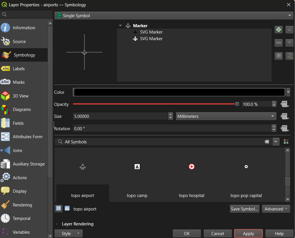
- Right-click the airports layer and choose Properties, then the Symbology tab.
- With Single Symbol selected at the top, scroll the symbol library at the bottom and choose a marker such as topo airport. Set the Size to about 5 millimeters.
- Click Apply.
Now color the airports by how they are used:
- Change Single Symbol to Categorized.
- Set Value to
use. - Click Classify. Each airport type gets its own color.
- Double-click a symbol to change its color or size. Use clearly different colors (or shapes) for the four types.
- Click OK.
Each renderer is suited to a type of data:
| Renderer | Use for | Example |
|---|---|---|
| Single Symbol | Showing where things are | All airports in one style |
| Categorized | Categories (no order) | Airport use
|
| Graduated | Numbers (low to high) | County density
|
To rename the layer, as it will appear in the legend, open Properties > Source and change the Layer name (for example, to “Airports by use”).
Part 5: Build a choropleth map
Now load the Indiana counties and shade them by population density.
- Load the Indiana counties web address the same way as in Part 2.
- Open Properties > Symbology and change Single Symbol to Graduated.
- Set Value to
density. - Choose a Color ramp such as Blues or Viridis.
- Set Mode to Natural Breaks (Jenks) and Classes to 5.
- Click Classify, then Apply (not OK yet).
- Change Mode to Equal Interval, click Classify and Apply. Then try Equal Count (Quantile). Watch how the map changes.
Population density in Indiana is very skewed: most counties have fewer than 200 people per square mile, and Marion County (Indianapolis) has over 2,000. With Equal Interval, almost every county lands in the lightest class. Choose the mode that best shows your message, and click OK.
Why density and not population?
The layer also has pop_2012, a count. Shading areas by a
count mostly shows where big counties or big cities are. Density (people
per square mile) is a rate, so it can be compared fairly between
counties of different sizes. See the Normalization section of the Data
Visualization module’s Fundamentals
of Map Design episode.
Part 6: Create a map layout
To export a finished map with all its elements, use a Print Layout.
- Go to Project > New Print Layout and give it a name.
- Add the map: choose Add Item > Add Map, then click and drag a rectangle on the page.
- Add a title: choose Add Item > Add Label, drag a box above the map, and type your title in the Item Properties panel. Make it large.
- Add a legend: choose Add Item > Add Legend and drag a box. In Item Properties, you can rename entries and remove the basemap from the legend.
- Add a scale bar: choose Add Item > Add Scale Bar. Set the units to miles or kilometers.
- Add a north arrow: choose Add Item > Add North Arrow.
- Add a source line: add another label at the bottom with the data source and your name, for example “Data: U.S. Census Bureau, BLS. Map by A. Student, 2026.”
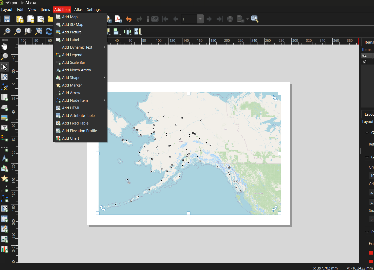
Use Item Properties to change fonts, sizes and frames. Use the Move Item Content tool to pan the map inside its frame without moving the frame.
Part 7: Export
- In the layout window, choose Layout > Export as Image (PNG) or Layout > Export as PDF.
- Choose a file name and location and accept the default options.
- Save the project again (
.qgz). The layout is saved inside the project.
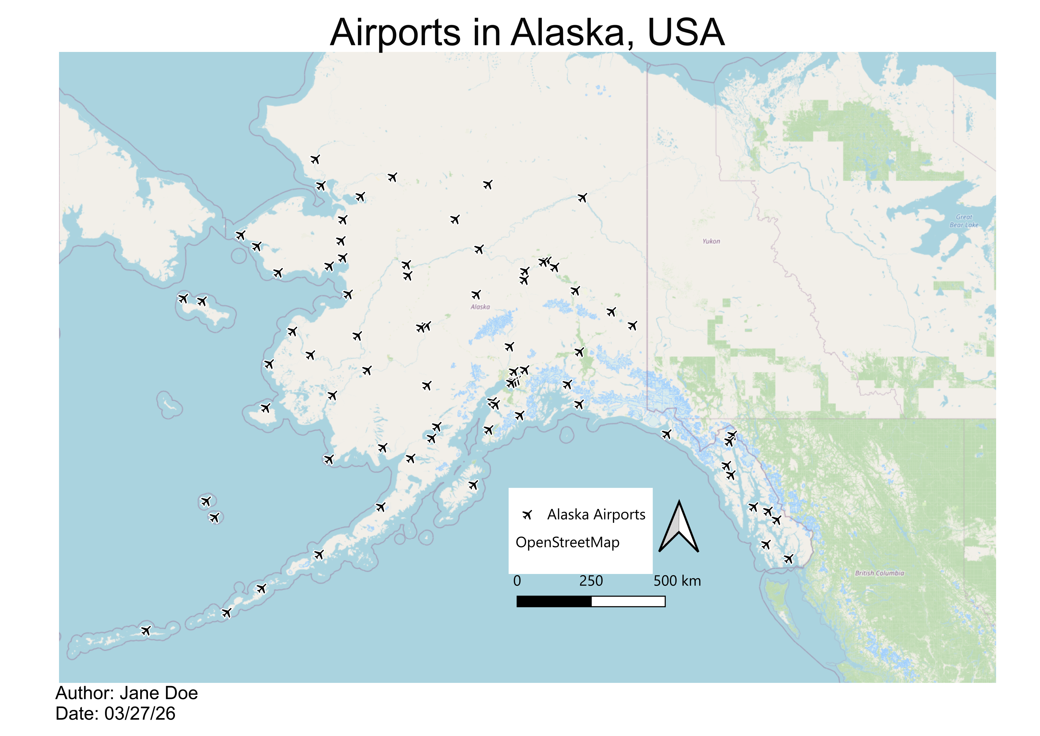
This example uses a single airport symbol. Your version will also show the airport types from Part 4. Notice that it is missing one element from our list: a data source line.
Common beginner mistakes
- Forgetting to save the project
- Mapping counts instead of rates on a choropleth map
- Leaving layer names such as
indiana_countiesin the legend - Using too many classes or a rainbow color ramp
- Leaving out the source line, legend or title
Keep it simple
Start with a clear, simple map. Add complexity only when it helps the reader.
Hands-on exercise
Challenge 1: An unemployment map of Indiana
Using the Indiana counties layer, create and export a finished map of
2016 unemployment rates (unemp_2016).
- Use Graduated symbology with 5 classes and a sequential color ramp.
- Try two classification modes and pick the one that shows the pattern best.
- Build a layout with a title that states what the map shows, a legend with units (%), a scale bar, a north arrow and a source line.
- Export it as a PNG.
-
Value:
unemp_2016. Color ramp: a single hue such as Oranges or Blues (light for low, dark for high). - Mode: unemployment ranges only from about 3.1% to 6.6% and is not very skewed, so Natural Breaks or Equal Interval both give readable maps. Quantile also works if the message is about rankings.
- Legend: rename the layer to something like “Unemployment rate, 2016 (%)”.
- Title: for example, “Unemployment was highest in northwestern and southern Indiana in 2016”. Check your own map before writing a conclusion like this.
- Source: “Data: U.S. Bureau of Labor Statistics, 2016.”
Challenge 2: Fix the projection (optional)
Alaska looks stretched over the OpenStreetMap basemap, which uses Web Mercator. Change the project’s coordinate reference system to one designed for Alaska and compare.
Click the EPSG code in the bottom-right corner of the QGIS window (or Project > Properties > CRS), search for 3338 (NAD83 / Alaska Albers), select it and click OK. The map is redrawn in an equal area projection for Alaska, and the state no longer looks enormously stretched. The basemap is reprojected too, although its labels may look slightly blurred.
Layer CRS and project CRS
Every layer has its own coordinate reference system (CRS), shown under Layer Properties > Information. The project also has a CRS, shown in the bottom-right corner of the window. QGIS reprojects layers on the fly so that they line up on screen, which is convenient but can hide a layer with a wrong or missing CRS. Two habits avoid most problems:
- Before measuring distances or areas, set the project CRS (and reproject layers you will analyze) to a projected system in meters, such as EPSG:26916 (UTM zone 16N) for Indiana.
- If a layer appears in the wrong place, check its CRS before anything else.
Notebook 4b in this module shows the same ideas in Python, and the Data Management module’s Coordinate Reference Systems episode explains the theory.
Final takeaways
- QGIS is a free, powerful tool for designing maps.
- Layers can be loaded from files on your computer or directly from a web address.
- Categorized symbology suits categories; graduated symbology suits numbers.
- The print layout is where map elements (title, legend, scale bar, north arrow, source) come together.
- What challenges did you face while making your first map?
- How would you change your map for a different audience?
- Add Vector Layer with the HTTP(S) protocol loads data straight from a web address.
- The attribute table holds the data behind every styling choice.
- Use Categorized for categories and Graduated for numbers, and compare classification modes.
- A Print Layout combines the map with its title, legend, scale bar, north arrow and source.
- Save the project often; export layouts as PNG or PDF.
- Check layer and project coordinate systems before measuring anything.